Looking to design a playful, vibrant grocery shopping app design like Sweet City? These UI screens offer a glimpse into a well-structured, user-friendly mobile experience tailored for snack lovers and everyday shoppers alike.
This screen showcases the onboarding and side navigation design of a Sweet City-style grocery app. The splash screen features a playful candy icon centered against a vibrant purple gradient, reflecting a fun and friendly brand identity. The account menu slides in with clean, minimalist icons offering access to user essentials like account details, order history, and addresses. Options like Live Support, Store Preview, and Settings are clearly listed to enhance the user experience and streamline navigation.
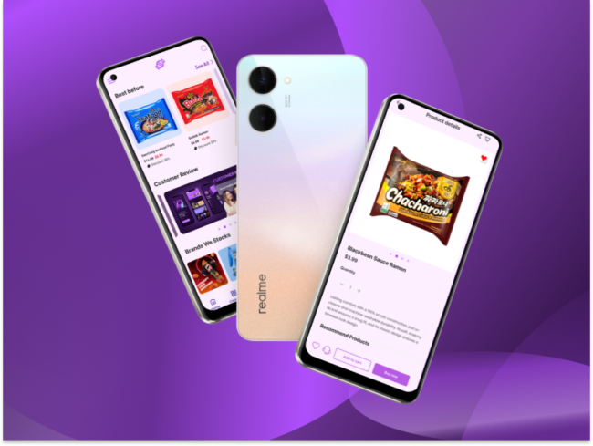
Full App Layout & Shopping Flow
The home screen presents colorful product banners and curated collections like Chocolates, Sweets, and Gums & Jellies, followed by a dynamic Just In section. The product detail page highlights a featured snack with pricing, quantity adjustment, and add-to-cart options. Meanwhile, the third screen emphasizes time-sensitive deals, customer reviews, and popular brands, reinforcing product discovery and trust-building. The consistent purple theme unifies the experience with a playful, modern aesthetic.
From seamless navigation to engaging product displays, this design nails both form and function. If you want to build a mobile app like this, try Simicart Shopify mobile app builder. It’s fast, flexible, and made for eCommerce success.