Mobile product page design & Customer Account Setup (with examples)

Welcome to Chapter 3 of the Ultimate Guide to Mobile App Design with Simicart! In this chapter, we’ll cover Mobile Product Page Design & Customer Account Setup 101. You’ll learn how to design product pages that captivate users and optimize conversions, while also creating an easy, seamless account setup process. With practical examples and tips, we’ll help you enhance the mobile shopping experience and drive customer loyalty. Let’s dive in!
| Ultimate Guide to Mobile App Design Series: Chapter 1: Introduction to Mobile App Design for Ecommerce Chapter 2: Product Search & Form Entry >>This article: Chapter 3: Product Catalog & Customer Account Chapter 4: Mobile shopping cart design Chapter 5: Checkout & Usability |
Benefits of an effective mobile product page design
With a growing number of consumers accessing the internet primarily through mobile devices, optimizing product pages for mobile use offers several significant benefits.
1. Improved user experience (UX)
A well-designed mobile product page provides a seamless and intuitive experience, allowing users to navigate easily without excessive scrolling or complicated layouts. Key elements include:
- Concise Information: Important details should be readily visible without requiring extensive scrolling, ensuring users can quickly find what they need.
- Swipe and Zoom Features: Enabling users to swipe through images and zoom in on product details enhances interactivity and engagement.
- Clear Call-to-Action (CTA): Prominently displaying the “add to cart” button above the fold increases the likelihood of conversions.
>> See more: The Ultimate Guide to Ecommerce UI Design
2. Increased conversion rates
A mobile-optimized product page can significantly boost conversion rates. Research indicates that:
- 92% of buyers are more likely to purchase after reading trusted product reviews, which should be easily accessible on mobile pages.
- Implementing features like customer reviews and recommendations can further encourage purchases by building trust.
3. Enhanced discoverability and SEO benefits
Search engines favor mobile-friendly websites, which can lead to better rankings in search results. A mobile-first design approach ensures that:
- Websites are optimized for mobile-first indexing, improving visibility and attracting more visitors.
- Content is prioritized effectively, as mobile pages typically focus on essential information that aids users in their buying journey.
4. Adaptability across devices
Designing with a mobile-first strategy means creating a site that works well across various platforms:
- A consistent user experience across smartphones and desktops increases customer satisfaction and loyalty.
- By starting with a simpler design for mobile, businesses can later enhance the desktop version without losing functionality or content quality
Guide for Mobile Product Catalog Design
The ability to access product information easily, including scanning product image, viewing product details, spotting special products and checking stock availability, is extremely important to mobile shoppers when making purchase decisions. Capture their purchase intent by present your in-app product catalog in the most delightful way to users.
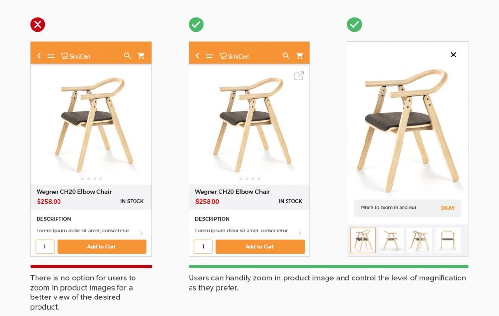
10. Allow users to zoom in product images
Product image is one of the most important elements on the product page. The ability to have a clear view of the product is critical for users to make product decision with confidence. Unlike desktop screens, viewing product image from a small mobile device can be a challenge for users. To help them get a better view, allow users to zoom in and out the product images with their preferred level of magnification.

✓ Users can handily zoom in product image and control the level of magnification as they prefer.
11. Provide full product options
For products with multiple options, let users browse all available product variations and their current status: availability, sizes, color choices,.. Lack of information about product options may lead to confusion and frustration. The product detail page should be designed to make product variations clear and intuitive to understand.

✓ Allow users to quickly understand all product options, which of them are available or currently unavailable.
12. Show stock availability on product listings
Users appreciate it when the product listings enable them to learn about stock availability. They may get frustrated browsing through a long list of products just to find out that their desired item is out of stock. Once again, be sure to show stock availability on listings to avoid this disruptive experience. Customers will still be able to look at your wide range of product offerings while staying informed of its current availability.


13. Show product recommendations prior to checkout
When users need product recommendations on alternatives or add-on items, they expect the app to surface related products before they reach checkout. The best way to achieve that is to show product recommendations on product page, in the cart or relevant pages prior to check out.

✓ Product recommendations provided before users reach checkout help guide better purchase decision for users.
14. Show both regular / special price and percent discount
Make the most of your promotions by showing users how much they’ll save on a discounted product. Both regular and special prices should be displayed as a comparison. Labeling your products with percent discount is a great way to catch users’ attention.

✓ Original and new prices, as well as discount percent, are all displayed to show users how much they’ll save.
Guide for Customer Account Setup
Growing customer base is one of the top priorities for most businesses. By encouraging mobile shoppers to create a customer account, your brand can deepen customer engagement and conversion opportunities while taking a step further in nurture long-term customer relationships.
15. Enable fast login using social accounts
Most users are bothered by having to create new accounts. Some of them would rather leave the app rather than complete registrations. In this case, providing a quick option to login via social accounts is a good solution. Third party login simplifies the account registration experience for users, which minimizes the number of steps required to create an account and enable one-click login to the app. Adopting a fast login method helps reduce the risk of abandonment and increase usability for the app.

✓ Offer a fast social login option to make account authentication a seamless experience.
16. Allow users to checkout as guest
For users making their first purchase, they may expect a convenient way to quickly checkout, which does not require them to create an account in order to complete a purchase. Forcing users to register at the start of the experience can annoy them or drive them away. A common solution is to provide guest checkout at the point of conversion. Prompt customers to sign in to save purchasing information for more efficient future experience while offering an option to checkout as guest and sign up later.

✓ Prompt customers to sign in to checkout while providing an option to checkout as guest and sign up after completing checkout.
Mobile product page design examples
Here are seven excellent examples of mobile product page designs that effectively enhance user experience and drive conversions:
1. Dr. Squatch
Dr. Squatch’s mobile product pages feature a clean layout that emphasizes product images and descriptions. The design includes options for bundling products, which encourages higher cart values.

2. Holstee
Holstee utilizes storytelling effectively on their product pages, combining engaging visuals with detailed descriptions. They also include customer testimonials and recent purchase notifications to build trust.

3. Hiya
Hiya’s mobile pages are designed for parents, showcasing their children’s multivitamins with easy navigation and clear subscription options, making it simple for users to understand the benefits and offerings.

4. Leesa
Leesa’s product page stands out with its use of social proof, featuring expert reviews and a straightforward layout that highlights key features and pricing, facilitating quick decision-making.

5. Luxy Hair
Luxy Hair addresses potential confusion with a wide range of products by using clear categories and virtual try-on features, allowing users to visualize how different hair extensions will look.

6. Bellroy
Bellroy’s mobile product page design is interactive, allowing users to compare wallet sizes visually. The UI focuses on showcasing the slimness of their wallets while providing essential information succinctly.

7. Lenskart
Lenskart enhances the eyewear shopping experience with its “Try On” feature, enabling customers to virtually see how glasses fit their faces using their mobile device cameras, increasing confidence in purchasing decisions.

In conclusion, an engaging product page and a seamless account setup are vital for creating a standout mobile shopping experience. By implementing the strategies shared in this chapter, you can boost user satisfaction, simplify the buying journey, and drive more conversions.
Ready to bring your vision to life? With Simicart’s Shopify mobile app builder, you can easily design stunning product pages and intuitive account setups that keep customers coming back. Start building your mobile app today and set your business apart!

