Mobile app search design & Form Entry (with examples)

Welcome to Chapter 2 of the Ultimate Guide to Mobile App Design with Simicart! In this chapter, we’ll explore Mobile App Search Design & Form Entry—two crucial elements for creating a seamless app experience. You’ll learn how to design intuitive search functions that deliver fast, accurate results and optimize form entries for effortless user input. With real-world examples, we’ll help you create a user journey that’s smooth, efficient, and conversion-focused. Let’s dive in!
| Ultimate Guide to Mobile App Design Series: Chapter 1: Introduction to Mobile App Design for Ecommerce >>This article: Chapter 2: Product Search & Form Entry Chapter 3: Product Catalog & Customer Account Chapter 4: Mobile shopping cart design Chapter 5: Checkout & Usability |
What makes awesome mobile app search design?
Here are the essential components and best practices for creating an awesome mobile app search design:
1. Prominent Placement
- Visibility: The search bar should be placed in a prominent location, typically at the top or bottom of the screen, where users expect to find it. This helps ensure that it is easily accessible and noticeable.
- Consistency: Maintain a consistent placement across different screens and pages to enhance predictability for users.
2. User-Friendly Interface
- Minimalist Design: Use a clean and simple design for the search bar, incorporating recognizable icons like a magnifying glass to indicate its function. The input field should be large enough for easy interaction.
- Clear Labels: Clearly label the search bar and use descriptive placeholder text to guide users on what they can search for, making the interface intuitive.
>> See more: The Ultimate Guide to Ecommerce UI Design
3. Enhanced Input Methods
- Auto-Complete Features: Implement auto-complete suggestions as users type, which can significantly reduce typing time and guide them towards relevant queries. This feature not only enhances usability but also helps users discover content they may not have initially considered.
- Voice Search Capability: Incorporating voice search can provide hands-free convenience, particularly beneficial for users on the go.
4. Effective Result Presentation
- Dynamic Results: Display search results dynamically as users enter their queries. This provides immediate feedback and helps users refine their searches in real-time.
- Handling No Results: Clearly communicate when no results are found, offering suggestions or alternative queries to assist users in their search efforts.
5. Performance and Reliability
- Speed: Ensure that the search functionality in mobile app is fast and responsive, minimizing delays that could frustrate users. A slow search experience can lead to user disengagement.
- Error Handling: Implement robust error handling that gracefully manages exceptions, providing clear messages or suggestions when issues arise.
6. Filtering and Refinement Options
- Faceted Search: Allow users to filter results based on specific criteria (e.g., category, date), which can help narrow down results and improve the relevancy of what is displayed.
- Recent Searches: Incorporate features that allow users to view their recent searches or saved items, making it easier for them to revisit previous queries.
7. Accessibility Considerations
- Ensure that the search design is inclusive and accessible to all users, including those with disabilities. This may involve using appropriate color contrasts, text sizes, and providing alternative input methods.
Guide for mobile search design
One of the most common issues mobile users have with ecommerce apps is the ability to find the product they need. Providing a quick and efficient in-app search solution helps save people’s time and efforts in looking for the right item in your app, which is crucial to engage them further in their buying journey.
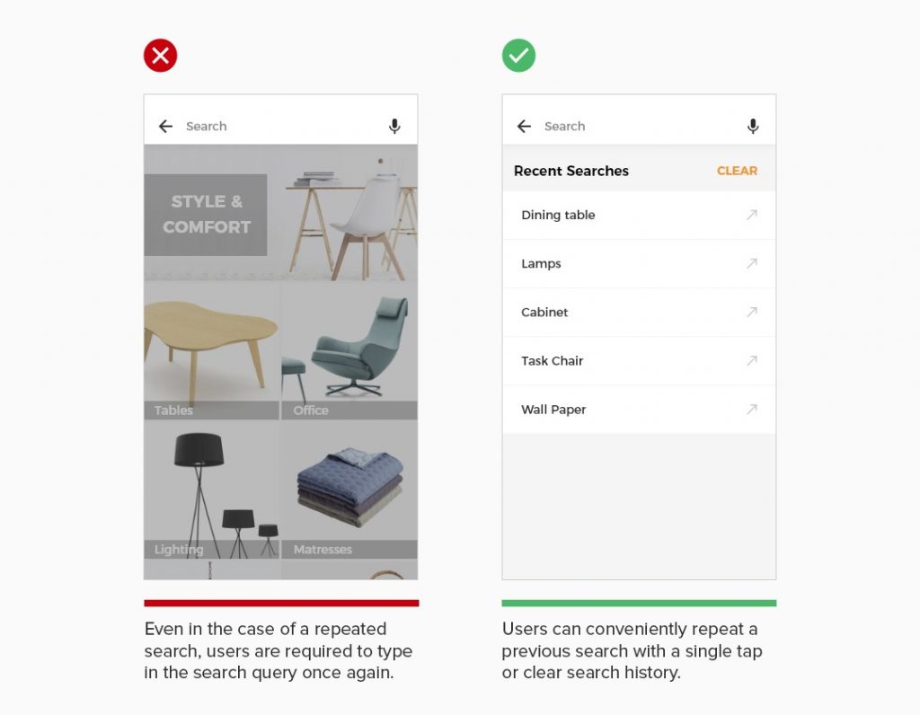
1. Show recent searches
By making recent search terms readily available, you can offer your customers a quick option to perform a repeated search with one tap. Presenting previous searches saves the users’ time and effort in typing out the same keywords again, while adding a layer of personalization to their shopping experience.
The enhanced search function makes it easy for users to conduct repeated purchases and encourages them to return to your app more often. If you have this function enabled in your app, make sure your users are also able to clear their saved searches.
2. Allow users to sort and filter search results
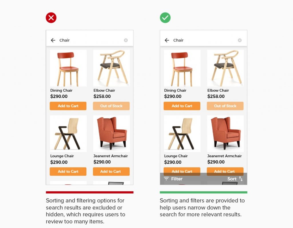
Most users would abandon your app if they can not find what they need quickly. A long list of search results require extensive scrolling on a small screen can get users overwhelmed. You can avoid this by giving them the ability to refine search results with useful product sorting and filtering options. Customers will be able to look at your wide range of product offerings and specify it to the few ones that match their needs and preferences.
3. Prominently display search option
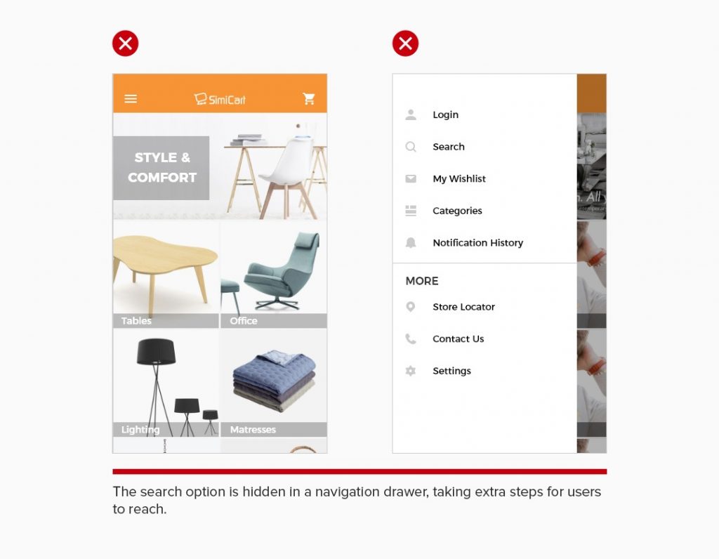
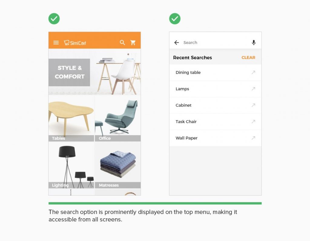
While most users adopt search function as the primary way to find products, the ability to spot search option is critical to craft the entire search experience in the app. For ecommerce apps, it’s beneficial to align the prominence in placement of search option with user expectation. Making search option easy for users to locate is the key to guide them through the purchasing path.
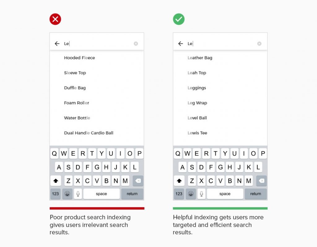
4. Show relevant search results
Users typically prefer using product search to browsing, especially on smaller screens. Effective and useful search is essential for users to find the product they need. Providing a high quality search indexing saves users’ time in completing the search process and drive them towards conversion.
Guide for mobile app form design
As mobile shoppers have particularly short attention span, complex and time-consuming form entry can cause them to abandon the checkout flow. To avoid this, make sure the form entry process is as easy and painless as possible.
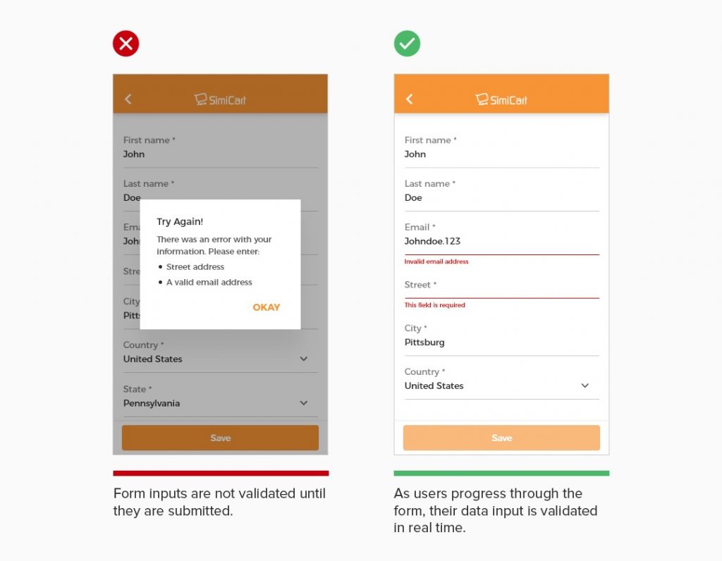
5. Communicate form errors in real time
Form errors are inevitable as they are a natural part of user data input. The key question then is how to make it easy for users to resolve those form errors. Users can get frustrated when going through the entire form entry process only to find out upon submission that they have made an error.
This can be eliminated with a real-time data validation, as users filling out the form. Once information is entered, automatically validate and inform users if there is any error. With properly implemented inline validation, the form allows users to locate errors and fix them quickly.
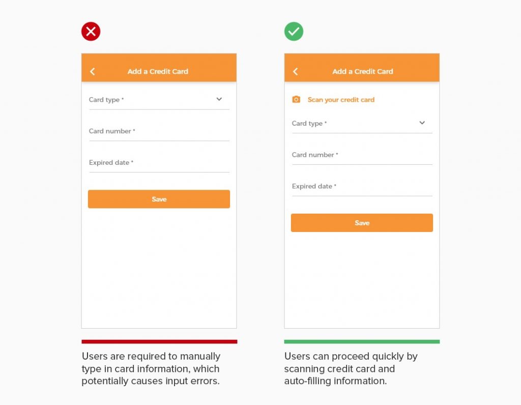
6. Allow users to scan card and auto-fill card information
Entering credit card number for online payments is not the most enjoyable experience, particularly on a small phone keyboard. To minimize errors from keying the digits manually and save users’ time and effort, make use of device capabilities such as the camera to collect credit card details. With an option to scan the credit card with their mobile devices, users can have card information automatically filled in the form and make online payments more easily.
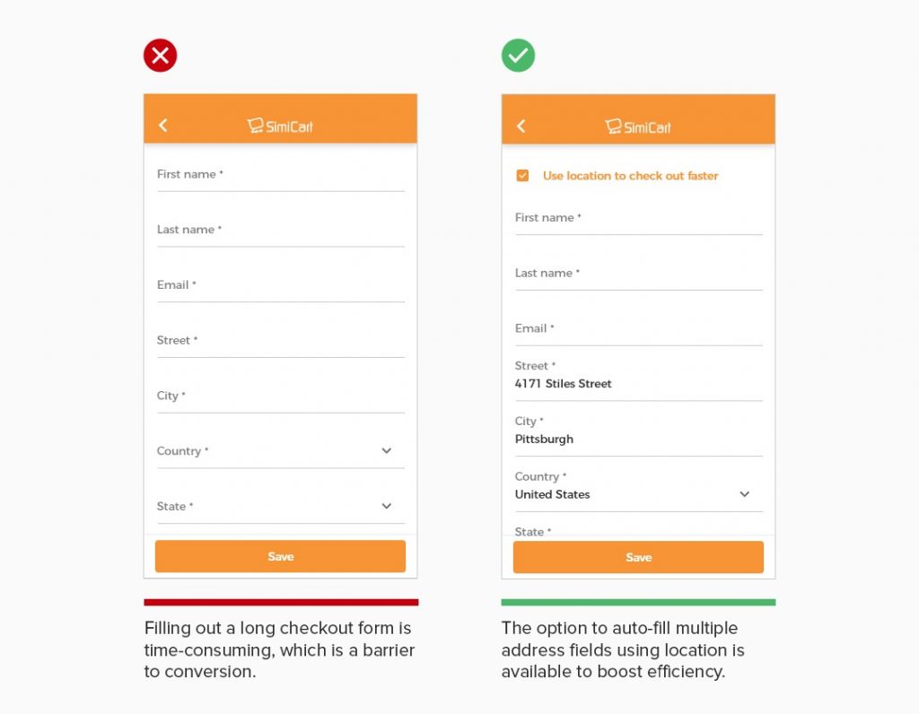
7. Allow users to auto-fill address using location
Filling out long checkout form on mobile devices can be slow and frustrating, which potentially leads to user drop-off and cart abandonment. To make things easier for users, device location can be utilized to speed up the process by automatically filling in the address fields. With device location enabled in app, users allow the app to detect their current location and complete the checkout form much faster. Optimizing the checkout form with address autofill help reduce abandonment rate and improve.
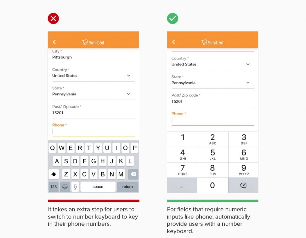
8. Match the keyboard with required text inputs
Make sure that form entry is user-friendly by matching the keyboard with required text inputs. For form fields that require numeric entry like phone, postal code,.. users should automatically be provided with a number keyboard, instead of a conventional keyboard. Forms that are able to interpret multiple input formats and adapt to how users enter the information help them proceed through checkout faster with less effort.
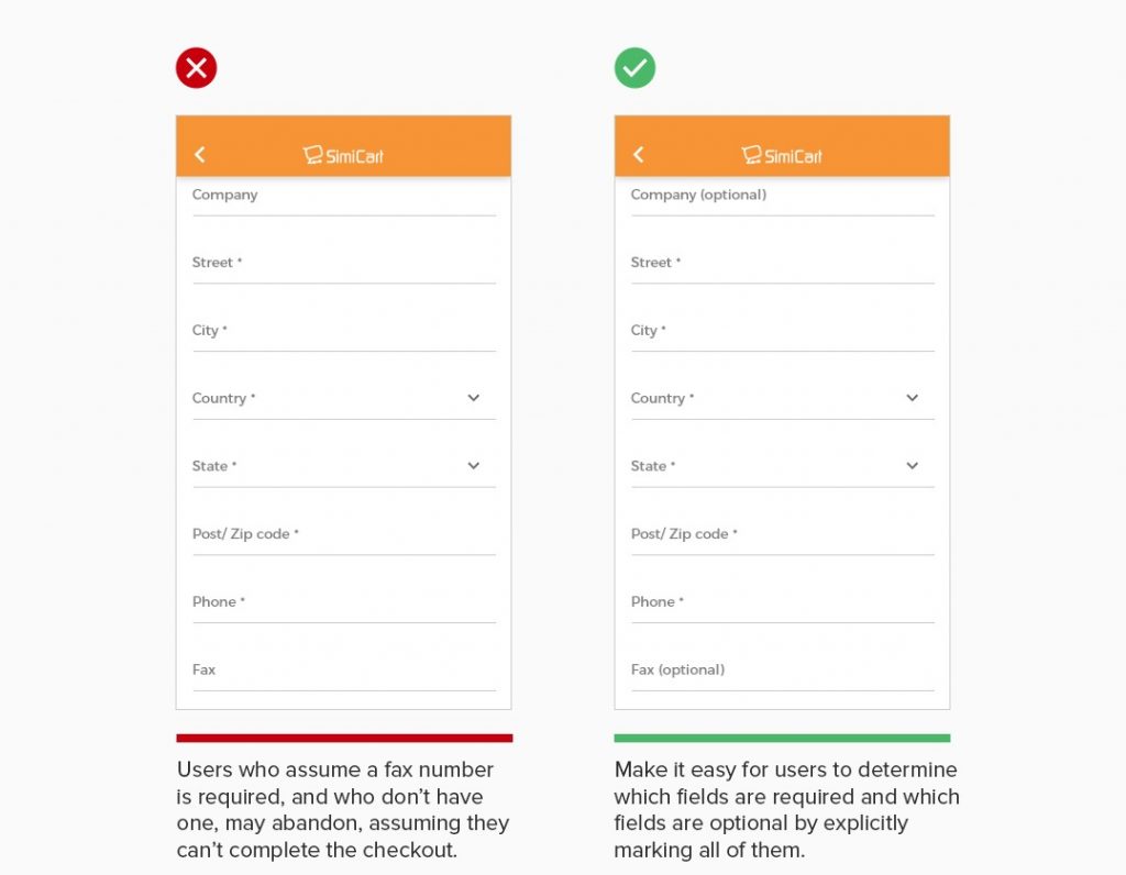
9. Mark both required and optional form fields
For a long checkout form, failing to explicitly mark both required and optional fields can lead to unnecessary validation errors, user confusion over which fields they must complete, a slower checkout process, and even cart abandonment. When a field is unmarked some users will have to guess to figure out whether an unmarked field is required or optional. This is especially problematic on mobile, where users have little page overview.
Best examples of mobile app search design
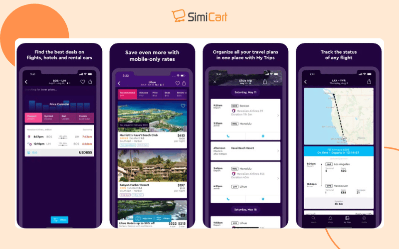
1. Momondo
Momondo’s travel app features a visually appealing and intuitive search interface that prioritizes user experience. The central search function allows users to easily input travel details, providing immediate access to flight and hotel options, enhancing engagement and simplifying the planning process.
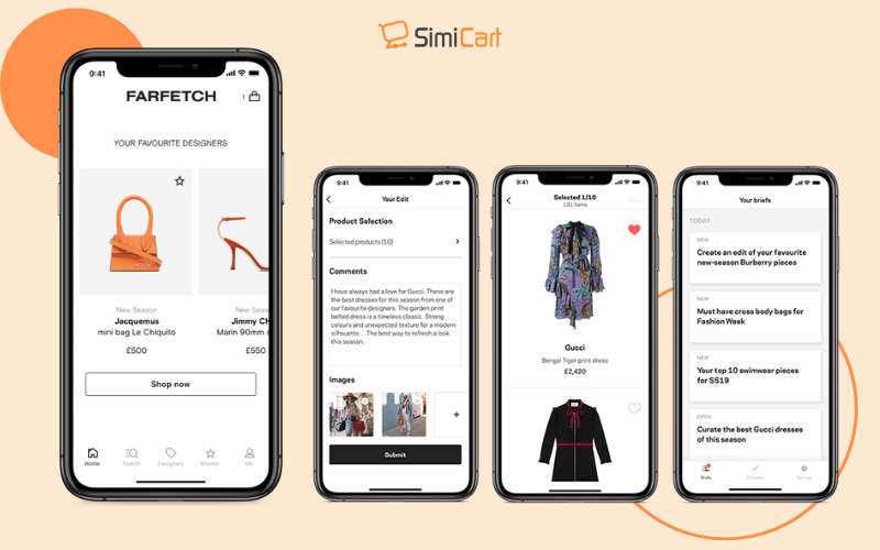
2. Farfetch
Farfetch combines aesthetics with functionality in its search design. The app not only features a traditional search bar but also showcases personalized recommendations alongside search results, inspiring users and facilitating a seamless shopping experience that drives conversions.
3. Google Maps
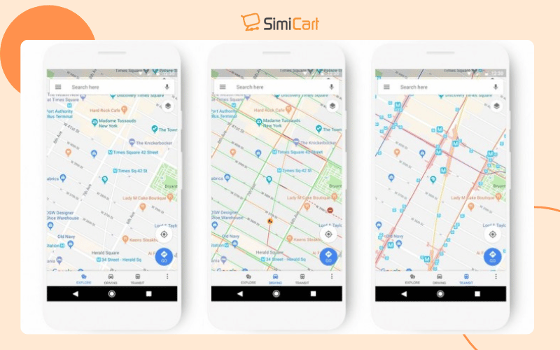
Google Maps excels in powerful search capabilities, allowing users to quickly find locations and businesses. Its dynamic filtering options enable users to refine searches based on distance, ratings, and services, ensuring relevant results tailored to individual needs.
>>> See more: Native Mobile App Builder: How to Choose the Right One?
4. Yelp
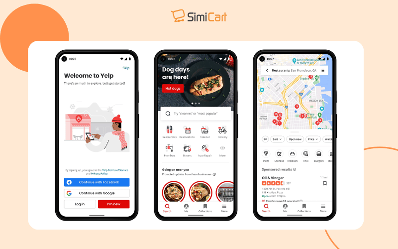
Yelp’s mobile app integrates advanced filtering directly into its search functionality, making it easy for users to find restaurants or services that meet specific criteria. This streamlined approach enhances efficiency and user satisfaction by delivering highly relevant results quickly.
5. McMaster-Carr
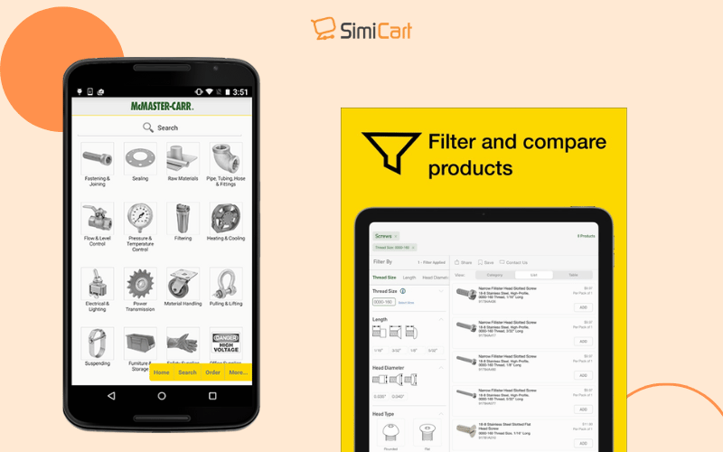
The McMaster-Carr app is designed for industrial supply needs, featuring an intuitive interface that allows multiple filters for precise product searches. This focus on usability enables professionals to navigate a vast inventory efficiently, ensuring they find specific items quickly.
In conclusion, effective mobile app search design and streamlined form entry are essential for enhancing user experience and driving app success. By applying the principles in this chapter, you can create intuitive features that keep users engaged and satisfied.
Ready to elevate your mobile app? With Simicart’s Shopify mobile app builder, you can easily design powerful search functions and effortless form entry systems. Start building your app today and deliver an experience your users will love!

