19 Shopify Store Design Tips For Beginners [Basic to Advanced]

Setting up a Shopify store is easy, but designing one that attracts visitors, keeps them engaged, and drives sales is a whole different challenge. 75% of shoppers judge a store’s credibility based on design alone, and a confusing or slow website can send potential customers straight to your competitors. Whether you’re just starting or looking to refine your store, this guide covers 19 essential Shopify store design tips—from foundational setup to advanced conversion tactics—to help you create a professional, high-performing Shopify store.
>> See more:
- 7 Best Free Shopify Apps For Store Design
- 50+ Best Shopify Themes in 2025 [Multipurpose And Niches]
- 5 Best Free AI Shopify Store Builders in 2025
Basic Shopify store design tips
A well-designed Shopify store isn’t just about aesthetics—it’s about creating a frictionless shopping experience that drives conversions. Research shows that a well-structured site can increase conversions by up to 200%. Here’s how to design your Shopify store for accessibility, performance, and engagement.
1. Accessibility
A truly successful Shopify store is one that’s accessible to all users, including those with disabilities. Following Wordbank, more than 15% of the global population lives with some form of disability, so neglecting accessibility means leaving potential customers behind.
- Use alt text for images—this benefits both visually impaired users and boosts SEO.
- Avoid flashing animations or cluttered layouts, which can cause sensory overload.
- Shopify offers built-in accessibility features—make sure you’re utilizing them.
- Ensure your site supports keyboard navigation, allowing users to browse without a mouse.
2. Color Palette
Color psychology plays a critical role in online shopping. Studies reveal that 90% of snap judgments about products are based on color alone. Choosing the right palette improves brand perception and readability.
- Stick to three to four core colors to maintain a cohesive look.
- Ensure sufficient contrast (e.g., dark text on a light background) to enhance readability.
- High-contrast combinations like black and white improve legibility, but softer alternatives like charcoal and off-white can create a more refined look.
- Use colors that evoke the right emotions—for instance, blue builds trust, while red creates urgency.

Choose a limited color palette of three to four colors to create a cohesive and non-distracting visual experience
3. High-Quality Images
Images are one of the biggest factors in purchasing decisions. Studies show that people remember 80% of what they see and only 20% of what they read. Poor-quality images can make your store look unprofessional, while high-quality visuals can boost conversions.
- Use high-resolution, lifestyle images that showcase the product in real-world settings.
- Maintain a consistent aspect ratio for product images to create a polished look.
- Consider adding videos—e-commerce stores with product videos experience a 144% increase in conversions.
4. Functional Site
Slow-loading websites kill sales. A 1-second delay in load time can reduce conversions by 7% (following Bigcommerce), and Google ranks slow sites lower in search results. To optimize performance:
- Monitor Core Web Vitals, which measure loading speed, interactivity, and visual stability.
- Compress images and videos to reduce load times.
- Be mindful of third-party apps—some plug-ins can slow down your store.
- Check your store’s performance in Shopify Admin → Sales Channels → Online Store → Themes.
5. Easy Navigation
38% of users will leave a website if they find navigation difficult. Implement a clear and well-structured menu to help customers easily find what they are looking for. Navigation Shopify store design tips is about creating a funnel that allows users to find what they’re looking for in as few clicks as possible:
- Follow e-commerce navigation standards:
- Logo in the top center
- Navigation links on the left-hand side
- Essential tools (cart, search, user account) in the upper right
- Design a clear menu structure with logical categories.
- Aim for a three-click rule—customers should reach any product page in three clicks or less.

Shopify store design tip: Implement a clear and well-structured menu
6. Strategic Typography
Typography shapes user experience, brand perception, and even sales—poor readability can lower conversions by 20%. The well-structured text helps visitors process information faster and navigate effortlessly.
- Prioritize legibility—Sans-serif fonts improve readability on screens; avoid overly decorative fonts for body text.
- Establish hierarchy—Large, bold headlines grab attention; a clear font-size progression guides the reader.
- Limit typefaces—Stick to one or two complementary fonts for a cohesive, professional look.
- Optimize for different elements—Bold, high-contrast fonts for CTAs; clear, scannable text for product descriptions.
- Avoid common mistakes—Too many fonts create clutter, poor contrast hurts readability, and unoptimized typography can break on mobile.
7. Whitespace
Incorporate whitespace to create a clean, uncluttered look that enhances visual flow. On product pages, balance detailed information with whitespace to spotlight related items and customer reviews. This design approach helps maintain a focused and engaging user experience.
Shopify store design tips for store setting
With 38% of users leaving a site if it looks unattractive and 70% of consumers abandoning their carts due to poor usability, nailing your store’s setup is crucial. Here’s a detailed, step-by-step guide to setting up your Shopify store for success.
8. Theme Selection
Your theme is the foundation of your store’s design and functionality. Shopify offers over 100 themes, ranging from free to premium ($150–$450). Consider starting with a free theme like Dawn if you’re on a budget—it’s lightweight and optimized for mobile. If you have a large product catalog, look for themes with advanced filtering options. For high-end products, a premium theme with rich media support may be worth the investment.
Questions to Ask Before Picking a Theme:
- How much are you willing to spend?
- How many products will you be selling?
- What kind of experience do you want to offer your customers?
>> Explore:
- 10+ Best Shopify Themes For Mobile [With 5 Star-rated]
- 50+ Best Shopify Themes in 2025 [Multipurpose And Niches]

Choose a theme that fits your budget, product catalog size, and desired features
9. Add Branding
A cohesive, well-branded shopping experience can increase conversions by up to 35%. Make sure your store looks and feels 100% yours by:
- Uploading your logo & colors
- Customizing your theme → Adjust fonts, spacing, and layout in Online Store → Themes → Customize.
- Branding your checkout page → Ensure a smooth, on-brand experience in Settings → Checkout → Customize.
Personalizing email templates → Edit order confirmations in Settings → Notifications → Customize Email.
10. Optimize Performance
A 1-second delay drops conversions by 7%—and if your store takes longer than 3 seconds to load, 53% of users will bounce. So you should aim for a PageSpeed score above 70 for better rankings & conversions. Shopify’s Core Web Vitals track key performance metrics like speed, interactivity, and stability.
- Optimize images & videos—compress them for faster load times.
- Minimize third-party apps—each extra plugin can slow your store down.
- Test your speed regularly in Sales Channels → Online Store → Themes.

Regularly check your core web vitals in the Shopify admin to ensure optimal site speed and functionality
11. Mobile Optimization
Your desktop store might look great, but 73% of eCommerce sales now happen on mobile devices. A non-mobile-friendly store = lost sales. Optimize your mobile by:
- Pick a responsive theme—Shopify themes automatically adjust to any screen.
- Simplify navigation—avoid cluttered menus, tiny buttons, or too many pop-ups.
- Test your site on multiple devices to ensure a seamless experience.
Tips: Shoppers won’t pinch-zoom or struggle with bad navigation—if the experience isn’t smooth, they’ll bounce within seconds.
>> See more: Shopify Mobile Optimization Guide: Speed, Design, SEO,…
Advanced Shopify store design tips for optimizing conversion rate
Getting traffic to your Shopify store is just the first step—turning visitors into buyers is where the real magic happens. With the average eCommerce conversion rate hovering around 2.5%–3%, optimizing your store for conversions can mean the difference between thriving sales and missed opportunities.
Here are advanced Shopify store design tips that help maximize your conversion rate with data-driven strategies.
12. A/B Testing
Brands that use A/B testing improve conversions by up to 49%. Small design tweaks can have a huge impact on buyer behavior.
- Test navigation layouts—structured menus can increase engagement by 30%.
- Use Shopify CMS to edit custom navigations and compare results.
- Leverage A/B testing tools like Google Optimize or Optimizely to test different product images, CTAs, and layouts.
- Analyze heatmaps & click data to see where users drop off and optimize accordingly.
Pro Tip: Even something as simple as changing the color of your “Buy Now” button can increase conversions by 14.5%.
13. SEO
Since 68% of all online experiences start with a search engine, ensuring your store is search-friendly is crucial for attracting organic traffic and increasing conversions.
- Optimize for mobile-first indexing—Google prioritizes mobile-friendly sites since 60% of searches happen on smartphones.
- Improve site speed—A 1-second delay can drop conversions by 7%; compress images and limit third-party apps.
- Use clean, keyword-rich URLs—Avoid cluttered links; structured navigation improves rankings.
- Add alt text to images—Google Image Search drives 62% of all searches; optimized images boost visibility.
- Leverage internal links & content—Stores with strong internal linking see a 40% ranking boost.

14. Call to Action
Using a specific, clear CTA can increase conversion rates by 161%. Placing the CTA button at the end of the product page can increase conversions by 70%. Your CTA should stand out and make purchasing effortless.
- Use high-contrast colors—Amazon’s “Add to Cart” button is bright yellow for a reason.
- Use action-driven text—”Get Yours Now” performs better than “Submit.”
- Place the CTA above the fold so users don’t have to scroll to find it.
- Ensure button size is mobile-friendly—48px+ for easy tapping.
Pro Tip: Don’t just have one CTA—reinforce it throughout the page so customers are always a click away from buying.
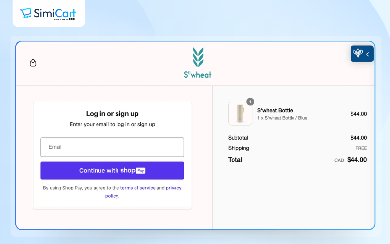
15. Checkout Optimization
The average cart abandonment rate is 69.99%, meaning nearly 7 out of 10 shoppers leave before completing their purchase. Streamlining checkout can recover up to 35% of lost sales.
- Enable guest checkout—forcing account creation drops conversions by 34%.
- Minimize checkout steps—the fewer clicks, the better.
- Autofill customer details—Google’s Autofill speeds up checkout by 30%.
- Offer multiple payment options—Shoppers using digital wallets (Apple Pay, Google Pay) convert 25% faster.
16. Choice Architecture
As an online store owner, you have the ability to influence your customers’ decisions through merchandising decisions. Curation is a key component of quality ecommerce merchandising. Behavioral economists call this choice architecture, which subtly influences buying behavior.
- Highlight bestsellers—People are 4x more likely to buy a product when it’s labeled as a bestseller.
- Limit choices—Too many options cause decision paralysis; 3–5 variations per product is optimal.
- Use urgency tactics—“Only 2 left in stock” messages can increase conversions by 9%.
Pro Tip: Instead of listing too many product variations, create curated bundles for a streamlined shopping experience.
17. Communication
Confusion kills conversions. A well-designed Shopify store makes buying effortless by giving customers all the information they need—without overwhelming them.
- Write clear, benefit-driven copy—Customers don’t care about specs, they care about how your product improves their lives.
- Use easy-to-read fonts—Overly decorative fonts reduce readability, hurting sales.
- Add pre-checkout pop-ups (with apps like Warnify) to address concerns before they lead to cart abandonment.
Pro Tip: Use FAQ sections, trust badges, and social proof to reassure hesitant buyers.
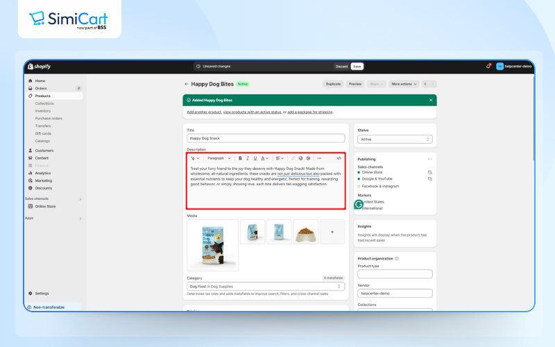
18. Detailed Product Descriptions
A great product description is a silent salesperson—it should make customers feel like they need your product NOW.
- Focus on benefits, not just features—”Keeps drinks cold for 24 hours” is more persuasive than “Double-wall insulated.”
- Use storytelling—help customers visualize how the product fits into their lives.
- Leverage social proof—add testimonials, star ratings, and user-generated content.
Pro Tip: Adding “Limited Stock” messaging can increase conversions by 9%—fear of missing out (FOMO) is a powerful motivator.
>> Explore: 15+ Free Shopify product description templates
19. Related Product Recommendations
Upsells and cross-sells drive 10–30% of eCommerce revenue. Amazon makes 35% of its sales from product recommendations—you can do the same. For example, if you own a fashion store, and someone is looking at the product page for a T-shirt, this is a great opportunity to say: “I think that this T-shirt would look great with these pants and this jacket.”
- Display “Frequently Bought Together” items—helps increase order value.
- Use Shopify’s Search & Discovery app to suggest complementary products.
- Highlight bundles—people are more likely to buy when they see a package deal.
Best Shopify store design examples
To inspire your Shopify store design, consider these examples and design elements:
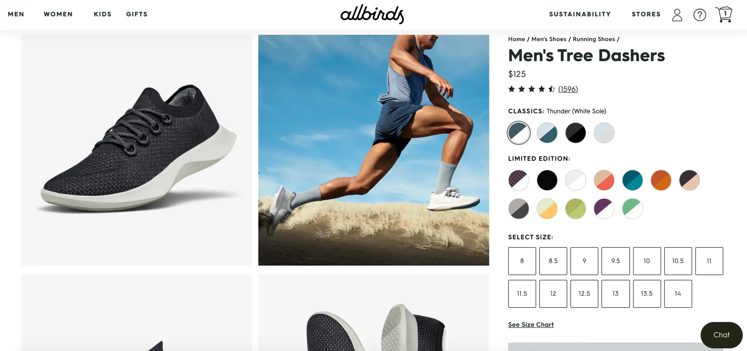
Allbirds
The Allbirds website employs a minimalist approach with a clean design that emphasizes product images and simple typography. The Allbirds site design incorporates great pictures from different angles that break up their homepage.
They also have moments of space and rest with different alignments to break up the page flow. Accent colors are only really seen in the header area and in the site buttons. Because the rest of the site design is so clean, they really stand out.
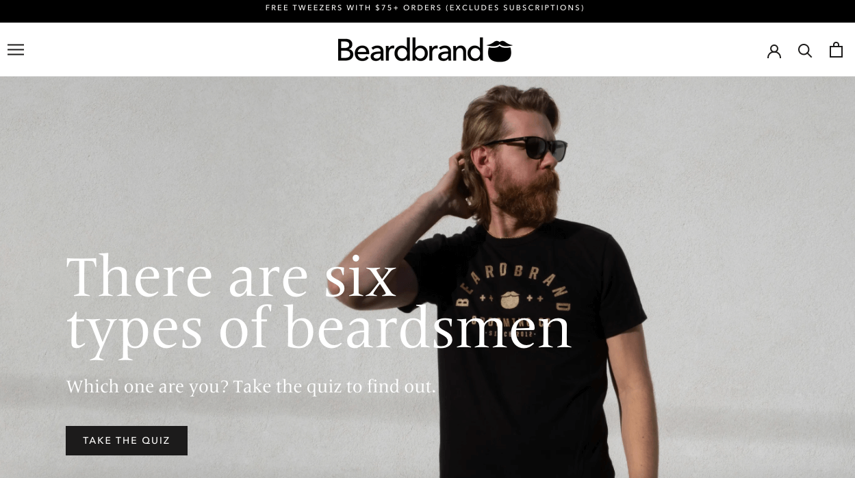
Beardbrand
This design exudes luxury with a dark, sophisticated color palette and elegant typography. Features high-quality product photography, storytelling through video content, and an emphasis on brand values and lifestyle.
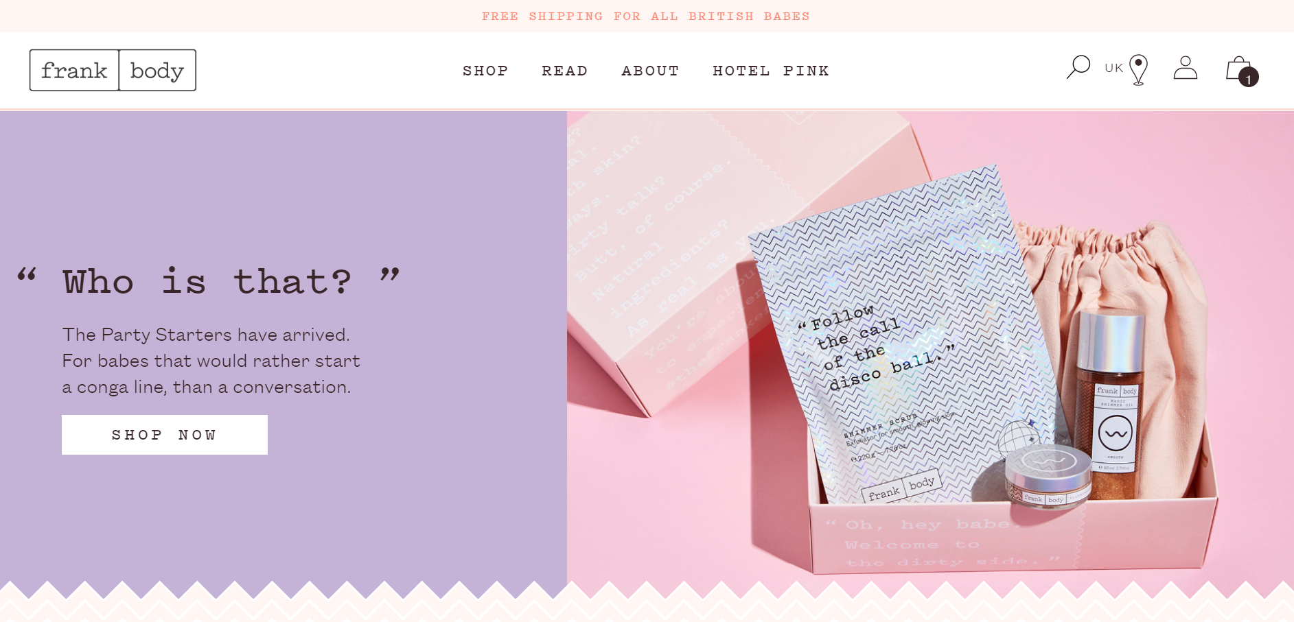
Frank Body
Frank Body’s website is playful and creative, with an artistic design, hand-drawn elements, and vibrant colors. The Shopify store design includes interactive content, creative product descriptions, and a quirky and engaging tone that aligns with the brand’s personality.
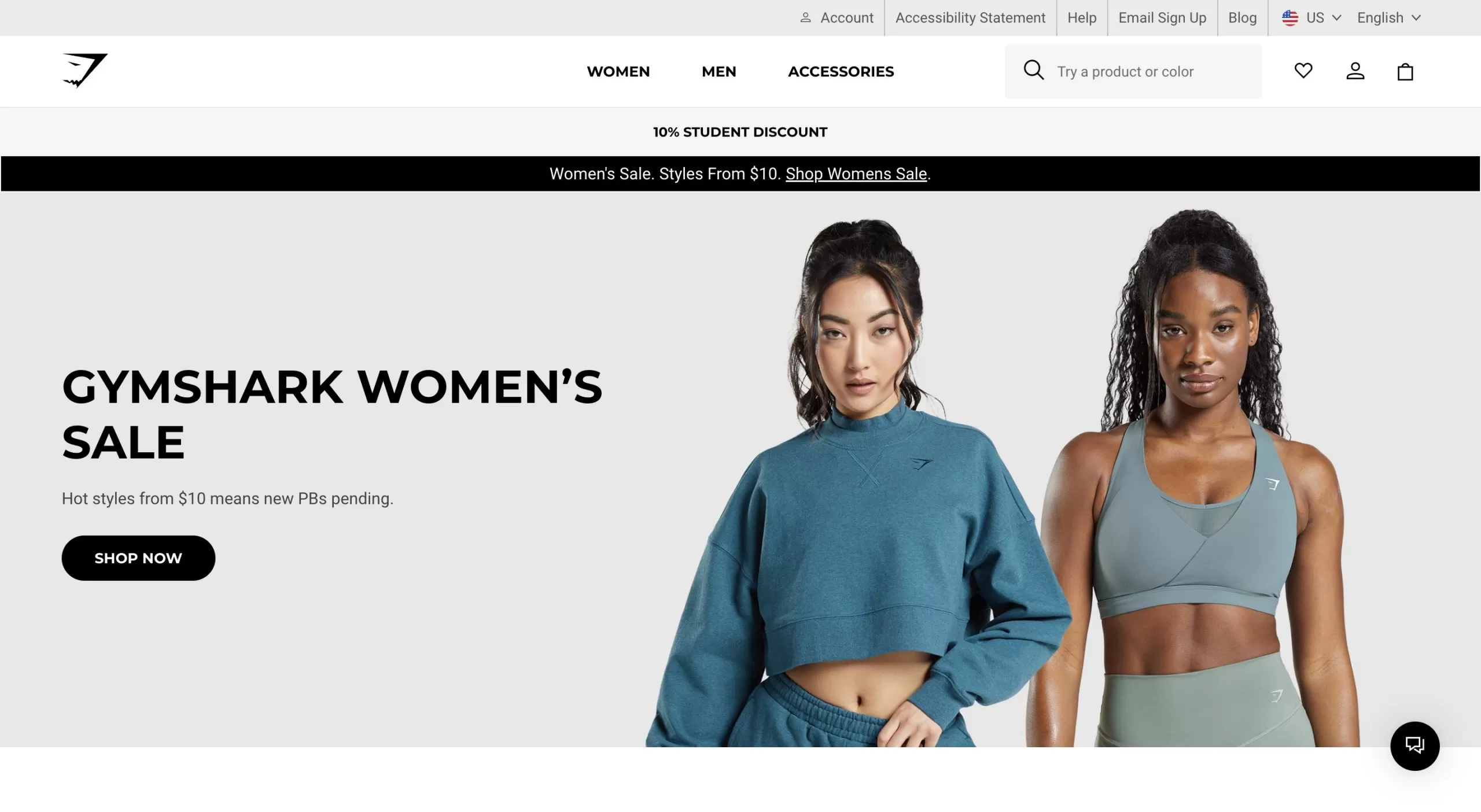
Gymshark
Gymshark’s website uses bold colors, dynamic images, and large typography to create an energetic and engaging experience. It focuses on user-generated content, such as customer photos and reviews, and uses bright color schemes and interactive elements like hover effects.
>> Read more:
- Decoding Gymshark Marketing Strategy: A Comprehensive Analysis
- 7+ Shopify Clothing Stores in the USA with High-revenue
In conclusion
Hopefully, this article has provided you with the most useful Shopify store design tips, helping you gain the knowledge and tools needed to create a professional, user-friendly, and conversion-optimized online store. By applying these strategies, you can attract more customers, boost sales, and grow your brand sustainably. Wishing you success on your Shopify journey!