Shopify Mobile Logo Size Full Guide In 2025

Ever uploaded a logo that looks great on your laptop, but when you check your phone—oops—it’s either way too big or barely there? You’re not the only one. One of Shopify’s little annoyances is how it applies the same logo size to both desktop and mobile, leaving your brand looking out of place on smaller screens.
In 2025, nailing your Shopify mobile logo size isn’t just about looks—it’s about keeping customers around and making those sales. A logo that fits perfectly on any screen? That’s a small detail that makes a big difference.
This guide will walk you through simple tweaks and expert tips to get your Shopify logo looking sharp and consistent, whether someone’s browsing on their laptop or scrolling on their phone. Let’s make sure your brand shines everywhere.
See more:
- [Recommended] Shopify Mobile Banner Size For Different Themes & Types 2025
- Best eCommerce Logo Ideas for 2025: Timeless Designs That Sell
- How to Turn Shopify Store into Mobile App
Best recommended Shopify logo size in pixels
Getting your Shopify logo size right can feel like a small detail, but it makes a big difference in how professional your store looks. If your logo is too big, it can throw off the whole layout—too small, and it gets lost.
The best size for most Shopify themes is 450 x 250 pixels—big enough to stay sharp without looking stretched. For square or compact logos, 200 x 200 pixels works well. On mobile, smaller is better, and 150 x 50 pixels tends to fit perfectly without overwhelming the design.
Here’s a quick table to break it down for you:
| Logo Use Case | Recommended size (Width x Height) | Notes |
| Main Logo | 450 x 250 pixels | Suitable for most themes |
| Square Logo | 200 x 200 pixels | Best for compact or square logos |
| Header Logo | 400 x 100 pixels | Ideal for the header section |
| Mobile Logo | 150 x 50 pixels | Optimized for mobile views |
| Footer Logo | 250 x 200 pixels | Recommended size for footer placement |
Additional tips for the Shopify logo:
- Using a transparent background for your logo
- Maximum Shopify image size: Up to 4.472 x 4.472 pixels, with a file size limit of 20 MB
- Aspect ratios: Maintain consistent aspect ratios (e.g., 1:1 for square logos, and 4:1 for horizontal logos).
How to change the Shopify mobile logo size?
To make sure your logo looks just right on mobile, here’s how you can adjust it through the theme’s code:
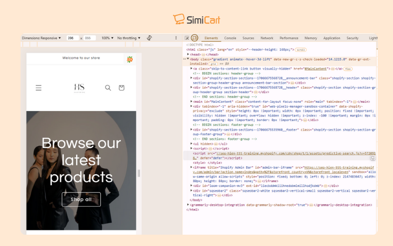
Step 1 – Inspect Element: Use your browser’s “inspect element” tool to view your store in mobile view. This helps you see how the logo appears on different devices.

Use your browser’s “inspect element” tool to view your store in mobile view
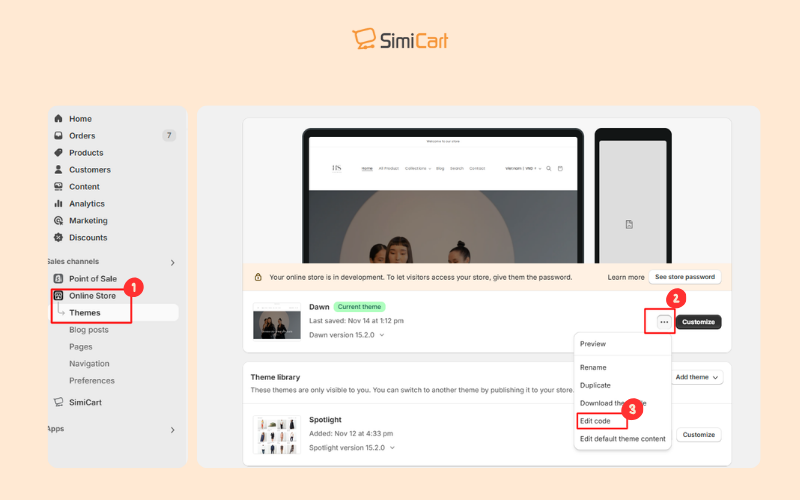
Step 2 – Access Theme Files: In your Shopify admin, go to Online Store > Themes and click on Edit Code for the theme you want to customize.

Access Theme Files
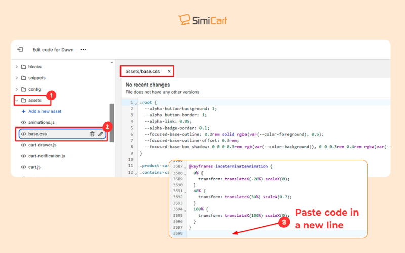
Step 3 – Locate CSS File: Find the CSS file, usually named base.css or theme.css, in the “Assets” folder.
Step 4 – Add CSS Code: Paste the code at the bottom of the CSS file or in the theme.liquid file (make sure to paste the code on a new line)

Add CSS code that targets mobile devices using a media query
Here are a couple of options for CSS code:
Option 1: Using Media Queries
This code adjusts the logo size for screens with a maximum width of 767 pixels:
@media only screen and (max-width: 767px) {
   .header__heading-logo {
      width: [desired width]px;
      height: auto;
   }
}
Replace [desired width] with the width you want for your logo on mobile. You can also use max-width instead of width.
You can also use scale instead of width to increase the logo size by a certain percentage. For example, this will increase the logo size by 10% on screens smaller than 748 pixels:
@media only screen and (max-width: 747px){
   .header__heading-logo {
      scale: 1.1;
   }
}
Option 2: Specific CSS Properties
- max-width: Sets the maximum width of the logo.
- scale: Increases the size of the logo by a percentage.
- margin: 0 important: Removes spacing from the top and bottom of the header.
Note: Where to paste the code: Add the code at the bottom of the base.css or theme.css file in the Assets folder. Alternatively, you can add the code within <style> tags in the theme.liquid file, before the </head> or </body> tag.
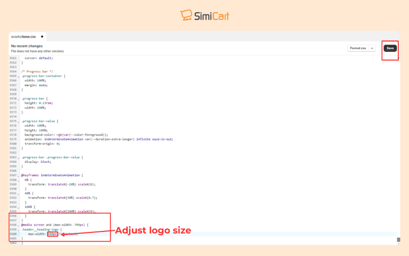
Step 5 – Save Changes: Click the save button to save the changes to the theme’s CSS file.

Paste the code to edit Shopify mobile logo size and save
Step 6 – Test: Check your store on different mobile devices to make sure the logo looks good.
Note: If the logo overlaps other elements, you may need to adjust those elements using CSS. For instance, you can use the following CSS code to adjust the padding for the search icon on screens that are 500px wide or smaller:
@media only screen and (max-width: 500px) {
  .header__search details .header__icon span{
     padding-left: 19px;
    }
  }
FAQs
How to change the logo size in the Shopify theme editor?
Here’s a quick guide to adjust your logo size directly in Shopify’s theme editor:
How to Change Logo Size in Shopify (Quick Steps):
- Go to Online Store > Themes and click Customize on your active theme.
- In the left sidebar, click Header
- Adjust the Logo Size slider and preview changes
- If available, tweak the Mobile Logo size separately (Some themes like Dawn or Debut allow mobile-specific settings)
- Hit Save in the top right corner.
How to make a logo bigger on Shopify mobile?
To make your logo bigger on Shopify mobile, you can follow these steps to adjust the CSS settings:
- First, head to your Shopify admin and click on Online Store > Themes
- Click the three dots next to your active theme and select Edit code
- Find the CSS file under Assets (usually named base.css or theme.css)
- Scroll to the bottom and paste this code:
@media only screen and (max-width: 749px) {
   .header__heading-logo {
      width: 150px; /* Adjust this size */
      height: auto; /* Keeps the logo's proportions */
   }
}
(Change the 150px value to increase or decrease the logo size)
- Save and preview your store
How can I reduce the logo size in mobile view only?
If you can’t change the Shopify mobile logo size with the theme editor, CSS solutions become useful:
- Go to Online Store > Themes and click the … (three dots) next to your active theme and select Edit code.
- In the left sidebar, search for base.css (or theme.css for some themes).
- Scroll to the bottom of the file and paste this code:
@media (max-width: 767px) {
  .header__heading-logo {
    max-width: 60% !important;
  }
  header.header--mobile-center {
    padding-bottom: 0 !important;
  }
  .header__heading-logo-wrapper {
    height: 80px !important;
  }
}
- Click Save in the top right corner.
This CSS tweak ensures the logo scales down smoothly on mobile screens without affecting the desktop view. Adjust the max-width and height values as needed for a perfect fit!
Getting your logo to look just right on mobile is more than a design tweak—it’s a statement of your brand’s professionalism. In 2025, seamless mobile experiences aren’t optional; they’re the expectation. By mastering Shopify mobile logo size through Shopify’s theme editor or custom CSS, you ensure your store looks sharp, trustworthy, and ready to convert visitors into loyal customers.
But why stop at just resizing logos?
For a fully optimized, mobile-first experience that elevates your entire store, consider SimiCart Shopify Mobile App Builder. We will support you in transforming your Shopify store into a sleek, high-performing mobile app that delivers fast, intuitive, and engaging shopping experiences—tailored to today’s on-the-go customers.
? Start building your mobile app with SimiCart today and give your brand the mobile presence it deserves!

