[Recommended] Shopify Mobile Banner Size For Different Themes & Types 2025

When it comes to having an effortless, beautiful shopping experience with mobile devices, nothing would come close to a Shopify store. The basis for achieving this includes your mobile banners. This post will dive into the ideal Shopify mobile banner size in different themes and what it promises with regard to fitting your store on any device. Let’s dive in!
See more:
- 15 Best Shopify Mobile App Builders For Your Store In 2025
- How to Turn Shopify Store into a Mobile App
- 10+ Best Shopify Headless Examples In 2025
Ideal Shopify mobile banner size in pixel
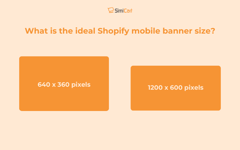
The recommended Shopify banner size for mobile typically ranges from 640 x 360 pixels to 1200 x 600 pixels, with a preferred aspect ratio of 16:9 for optimal display and fast loading times on mobile devices.
Besides, you should maintain image clarity while keeping file sizes under 150 KB to enhance user experience and site performance without causing delays in loading times.
>> You may concern: Shopify mobile optimization: speed, performance, design, SEO,….

Studies have shown that a 1-second delay in loading can decrease conversions by 7%. Therefore, optimizing Shopify mobile banner size for quick load time is important to sustain a high conversion rate.
Shopify mobile banner size for different types of banner
Optimizing your mobile Shopify banner size is essential for a seamless user experience. Here’s a table summarizing recommended sizes for various categories of mobile banners:
| Banner Type | Recommended Size (pixels) | Aspect Ratio | Notes |
| Header Banner | 1200 x 400 | 3:1 | Ideal for headers and hero sections |
| Collection Banner | 2048 x 2048 | 1:1 | Square images ensure better stacking on mobile devices |
| Slideshow Banner | 1200 x 600 | 2:1 | Balances quality and performance across devices |
| Blog Banner | 1800 x 1000 | 1.8:1 | Suitable for full-width blog banners |
| General Mobile Banner | 640 x 360 to 750 x 1334 | Varies | Ensures fast load times and good display on mobile devices |
Over 70% of users prefer to shop through mobile apps to mobile sites. Thus, it’s obvious that the mobile experience should be done well as it may become a key factor in even eCommerce.
Keep pace with the upward mobility trend with Simicart– the free Shopify mobile app builder for creating a simple, mobile-friendly shopping experience without any code. Take the first step towards making your mobile app today and get your store future-ready for eCommerce!

Recommended Shopify mobile banner size for specific theme
Different Shopify themes have specific recommendations and settings for banner aspect ratios.
| Theme | Recommended banner size (pixels) | Notes | |
| Desktop | Mobile | ||
| Dawn | 1920 x 1080 | 800 x 800 | The Dawn theme allows for separate images for desktop and mobile views, ensuring optimal display on all devices |
| Debut | 1200 x 400 | 800 x 800 | The Debut theme recommends a height of 400 to 600 pixels and a width of 1200 to 2000 pixels for banners. |
| Impulse | 1200 x 400 | 800 x 800 | The Impulse theme supports high-quality images; ensure your banners are optimized for both desktop and mobile views. |
| Prestige | 1600 x 600 | 800 x 800 | Prestige theme emphasizes high-end visuals; use high-resolution images to maintain quality across devices. |
| Narrative | 1600 x 600 | 800 x 800 | The Narrative theme is designed for storytelling; ensure your banners align with your brand’s narrative. |

How to make Shopify banners mobile-friendly?
You should make mobile responsive banner size so that they look good and work well on smaller devices. Here are some tips that can help you optimize your banners for mobile devices:
- Use mobile-optimized sizes: Upload images specifically designed for mobile devices. According to, the Shopify banner mobile size is around 1200 x 600 pixels or 640 x 360 pixels to make sure images fit well on smaller screens without cropping or distortion.
- Responsive design: Implement responsive design techniques by using CSS to adjust banner sizes based on the device. For example, you can set the banner height to match the screen width using CSS rules like:
@media screen and (max-width: 749px) {
.banner__media {
height: 100vw !important;
object-fit: cover;
}
}
- High-quality images: Always use high-resolution images to prevent pixelation on high-density screens. However, you need to optimize these images to keep file sizes manageable for faster loading times.
- Minimalist design: Keep the banner design simple and clutter-free. A minimalistic approach helps maintain legibility and visual appeal across different screen sizes.
- Test, test, test: Always test how your banners appear on various devices to ensure they look good and function correctly. You can make use of tools (like Neat A/B testing, Google Optimize,…) or real devices to check responsiveness and appearance.
- Consider slideshow or carousel options: When you want to showcase more than one product or message per banner, consider a banner with a slideshow or carousel. That presents itself dynamically rather than directly assaulting the viewer with too much information.
>> See more: Shopify mobile navigation: Best way to create, optimize, and fix issues
FAQs
What is difference between Shopify banner size for mobile and desktop?
The main differences between Shopify banner sizes for mobile and desktop are:
- Dimensions: Mobile banners are typically smaller (e.g., 640 x 360 to 1200 x 600 pixels), while desktop banners are larger (e.g., 1200 x 400 to 1920 x 1080 pixels).
- Aspect Ratio: Both often use a 16:9 aspect ratio, but mobile banners prioritize compactness.
- File Size: Mobile banners should be smaller (under 150 KB) for faster loading.
- Design: Mobile banners may stack elements vertically, while desktop banners can display them side by side.
How to show different Shopify banner images on desktop and mobile?
To display different banner images on desktop and mobile in your Shopify store, you will need to implement a code snippet that is not available in the theme customizer. Here’s how to do it:
- First, access your Shopify store’s code editor by navigating to Online Store and then clicking on Edit code for your theme.
- Use the search bar to find the file named “section-image-banner.css”.
- Scroll to the very bottom of the file, creating a new line.
- Copy the provided code (20 lines) here
- Paste the code at the bottom of the “section-image-banner.css” file and save.
- Next, go to the Theme customizer and select the banner.
- You will now see two image selection areas. The first image you upload will be displayed on a desktop, and the second image will be displayed on mobile.
- After setting the images and saving, the different banner images will appear automatically based on the device used by the customer to access the site. The switch happens automatically without needing to reload the page.
This method works for every Shopify theme, including the Down theme, Refresh theme, and Dawn theme. The code is available for free, and no payment is required.
What is the best Shopify mobile hero image size?
The best Shopify mobile hero image size is typically 800 x 800 pixels. An ideal size ensures an aspect ratio of 1:1. In addition to this size, another recommended size that can be used is 1920 x 1080 pixels (16:9 aspect ratio). It is best recommended for desktops but can also resize well for mobile use.
How to adjust the Dawn theme banner size for mobile view?
To adjust the banner size for mobile view in the Dawn theme, you can use CSS code to modify how the banner image is displayed:
- Go to Online Store > Theme > Edit code
- Asset > /section-image-banner.css > paste the below code at the bottom of the file.
@media screen and (max-width: 749px) {
.banner__media {position: relative;}
}
Last but not least, making the Shopify banners mobile-ready ends up being an additional factor to transform the user experience and make the store look good on the screen. Responsive design or uploading images separately for mobile and desktop, adjusting the Shopify mobile banner size, optimizing image files, and testing them across devices help make things practical and appealing for different audiences.
With all these tricks up your sleeves, your store is now ready to give those customers a seamless experience while shopping effortlessly from their mobile devices.

