Progressive Web Apps (PWA): Top 3 Case Studies

Imagine that you have just launched your start-up and your website looks awesome, but you don’t have enough budget to develop a mobile app, which may be important to your business strategy. However, it is very expensive and a bit risky. You will also have to spend a lot of time building a native app, but nobody knows your brand well. Will people trust your application enough to download it from the App Store or Google Play Store?
What’s more – will your customers/readers be determined enough to take some additional steps like closing your website, opening Google Play or the App Store and then patiently wait till the app has installed?
Remember that people are much more demanding these days. In other words, they are also very impatient – they expect fast solutions. Downloading such an app from an external store doesn’t sound like a very quick operation and native apps are not very accessible for every user. From the User Experience point of view, there are many obstacles for the customer before he achieves his (and your) goal.
And another thing – are you sure that your clients will have enough internal storage space to download your app?
So you will invest a lot of money in building a mobile app (both for IOS and Android) and you can’t be sure that people will actually use it. Ahh… and don’t forget about all these huge amounts of your marketing budget that you will need to spend on advertising and promotion!
But wait, don’t be panic, fortunately, you are living in 2019, when Progressive Web Apps are becoming a common solution when it comes to creating mobile apps!
Have you ever heard about Progressive Web Apps? If not, now is your chance to catch up on this latest technology trend or you will be left behind! We have already written a comprehensive article explaining what they are and why it’s worth choosing this option.
Today we would like to give you some inspiration and introduce success stories of brands that have already built Progressive Web Apps.
TRIVAGO

Trivago acquires a good reputation for hotel search engine that is available in 33 different languages. On the base of hotel’s information, pictures, ratings, reviews, filters, and other features, Trivago helps their users to find the best offer.
Problem

The problem is Trivago have noticed a significant increase in mobile users in recent years. The brand realized that the mobile experience is getting more and more important for their clients.
However, creating mobile solutions is not a piece of cake and this means making difficult choices. Specifically, the company wasn’t sure whether people would accept the cost of downloading a mobile app, just to check if it fits their expectations. They also noticed that many people have problems with a quality mobile connection. Due to these reasons, Trivago was looking for different opportunities than a native app.
Recommended reading: Progressive Web Apps vs Native Apps: Which Suit You Better?
Solution
Finally, they discovered Progressive Web Apps, whose features seemed to be perfect for their needs. At that time, they were looking for a solution that would provide them with push notifications, offline mode, and home screen shortcuts. And the most important factor for Trivago was the accessibility to this app through a standard mobile browser.

This PWA solution helped them to build an app without having to involve big teams of software developers. They focused on the most important features in the beginning, like push notifications, offline access and the possibility to add the app to the home screen. Of course, there were difficulties at first. They said that one of the biggest challenges was to create an intuitive User Interface because designing a mobile appearance is much more different than that on standard websites. According to Laura Oades, designer for the PWA:
“On mobile, you have the additional problem of crafting a UI that is platform agnostic and not confusing” and “PWA is largely unchartered territory in design, and a real opportunity for creative problem solvers to stretch themselves to define a new standard.”
The results

- The Trivago mobile website is available in 33 languages, across 55 countries.
- More than 500 000 people added a Trivago shortcut to their home screen and their engagement increased by 150%.
- Compared to previous mobile websites, Progressive Web App attracted far more users. Before PWA, only 0,8% repeat visits were recorded, now this number increased to an average of 2%.
- Push notifications turned out to be a perfect means of communication – they helped to increase conversion – the number of clicks in the PWA on hotel offers increased by 97%.
Recommended reading: 7 Best Progressive Web Apps in the Travel Industry

Pinterest is a social network that allows users to visually share, and discover new interests by posting (known as ‘pinning’ on Pinterest) images or videos to their own or others’ boards (i.e. a collection of ‘pins,’ usually with a common theme) and browsing what other users have pinned
Problem

After analyzing usage for unauthenticated mobile web users, they realized that their old, slow web experience only managed to convert 1% of users into sign-ups, logins or native app installs. The opportunity to improve this conversation rate was huge, leading them to an investment in the PWA.
The Pinterest PWA started because they were focused on international growth, which led them to the mobile web.
Solution
Over 3 months, Pinterest rebuilt their mobile web experience using React, Redux and webpack. Their mobile web rewrite led to several positive improvements in core business metrics.

The results
Their mobile web rewrite led to several improvements in performance.
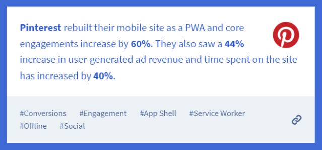
Time spent is up by 40% compared to the old mobile web experience, user-generated ad revenue is up 44% and core engagements are up 60%:


Pinterest’s old mobile web experience was a monolith — it included large bundles of CPU-heavy JavaScript that pushed out how quickly Pin pages could load and get interactive.
Their new mobile web experience is a drastic improvement.
Not only did they break-up & shave hundreds of KB off their JavaScript, taking down the size of their core bundle from 650KB to 150KB but they also improved on key performance metrics. First Meaningful Paint was down from 4.2s to 1.8s and Time To Interactive reduced from 23s to 5.6s.

Although Pinterest vend iOS & Android apps, they were able to deliver the same core home feed experience these apps do on the web in a fraction of the upfront download cost — just ~150KB minified & gzipped. This contrasts with the 9.6MB required to deliver this experience for Android and 56MB for iOS

As you’ve already known, Twitter is a social media platform, where people post short messages called tweets. It was created in March 2006. Now it has more than 335 million active users (July 2018).
Problem

Twitter noticed that users had to overcome many obstacles while using their mobile website.
Some of them were on slow mobile networks and had little space on mobile devices storage. As a result, visitors were reluctant to spend time on Twitter’s website or engage in posting and commenting more. Twitter wanted to find an attractive alternative for people who don’t use their native app or don’t have enough space for downloading this.
Solution

Twitter decided to build a Progressive Web App because it seemed to be the best combination of a modern website and native features. Instant loading, lower data consumption, and large accessibility were features that Twitter was looking for.
Results
The outcomes turned out to be very impressive – the numbers speak for themselves:
- 20% drop in bounce rate,
- 65% rise in pages per session,
- 75% rise in Tweets sent.

As in previous success stories, the “add to home screen” prompt and push notifications increased the user’s engagement significantly. As it is reported in this Case Study, Twitter noticed that 250 000 unique daily users run Twitter Lite from the home screen 4 times a day on average. What’s more, they’re sending more than 10M push notifications per day.

According to Twitter intentions, the PWA takes much less space (only 600 KB) than the native Android app (23,5 MB), so there’s a bigger possibility that people will have enough space in their internal storage to save it.
What’s more, Twitter added a data saver mode, that helps users to control the amount of mobile data used. Thanks to this option, you can choose which images or videos you want to fully load, and which may remain just as a preview.
Recommended reading: PWA SEO: Do Progressive Web Apps (PWAs) Benefit SEO? (With Stat and Examples)
Embrace the Future of Websites
PWA is the future of mobile applications. There’s a possibility that they will replace native applications with time, becoming a perfect combination of native app and website. In a world where the speed to adopt new technology is a competitive edge, businesses that manage to embrace the PWA moment earlier, can significantly drive revenue, increase user engagement while staying ahead of the competition.

