Best 12 High-Converting Mobile App Landing Page

If you’re in the mobile app game, you know it can be a real struggle to stand out from the crowd. With millions of apps competing for the attention of users, how do you ensure your offering is so irresistible that users can’t help but pay attention?
The way to go is to design a high-converting mobile app landing page. We’re about to spill the secrets behind 12 incredible examples that got it right when it comes to capturing conversions.
Keep reading and let’s get started!
>> See more:
- 11 Best Shopify Mobile App Development Services 2025
- 15 Best Shopify Mobile App Builders [2025 Review]
- 7+ Best Retail App Builders For Both Android and iOS
What is a High-Converting Mobile App Landing Page?
A high-converting mobile app landing page is a mobile-optimized web page designed to drive app downloads. This is where we show the app’s main features and benefits using compelling, benefit-driven copy and a prominent display of the app interface.
Testimonials and ratings increase trust and a frictionless conversion process with clear call-to-action buttons makes it easy for users to download. The app landing pages are tested and optimized continually to increase the conversion rates, using A/B testing to provide a smooth, mobile-first user experience to promote the app and grow the user base.
Top 12 High-Converting Mobile App Landing Page Examples
1. Aaptiv
What it is:
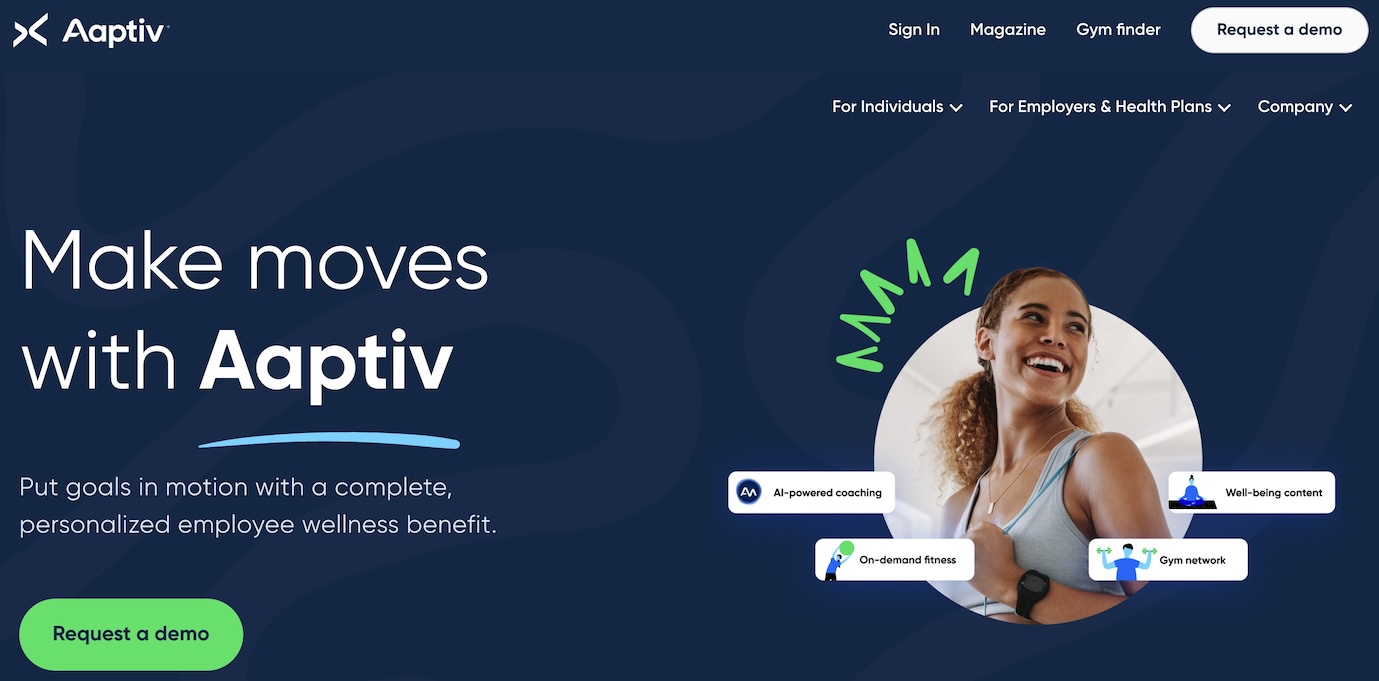
Aaptiv is a fitness app that features audio-guided workout classes and personalized programs for users. The concept is to provide a simple, versatile means for achieving fitness objectives in a society that is constantly on the move. Now let’s take a look at why it is on the list of high-converting mobile app landing pages.
Why it works:
- The testimonials from other companies make the app believable and thus more appealing to the potential user.
- Aaptiv creates a desktop and a mobile version of the page, so users are happy to see it on any device and the conversion rates go up.
- The page is very straightforward with its messaging and visual elements, allowing the page to stay focused on the app’s core value proposition and allowing visitors to understand what the app offers and why they should download it.
Read more: How to Create Mobile App No Coding
2. Headspace
What it is:
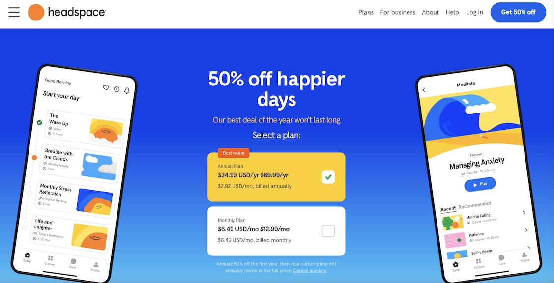
As a meditation and mindful app, Headspace wants to make its users healthier and happier. Guided meditations, sleep exercises, and other tools are all available through the app to help people reduce stress, increase focus, and get a sense of well-being.
Why it works:
- One-button conversion: The page has only one CTA – to sign up for a free trial, which also means downloading the app. This makes the conversion process quite simple and allows users to immediately get into using Headspace.
- Consistent branding: Even before downloading the app, users get a clear sense of Headspace’s brand and purpose. The landing page reinforces the company’s commitment to mental health and wellness through its copy, imagery, and overall design.
3. Muzzle
 What it is:
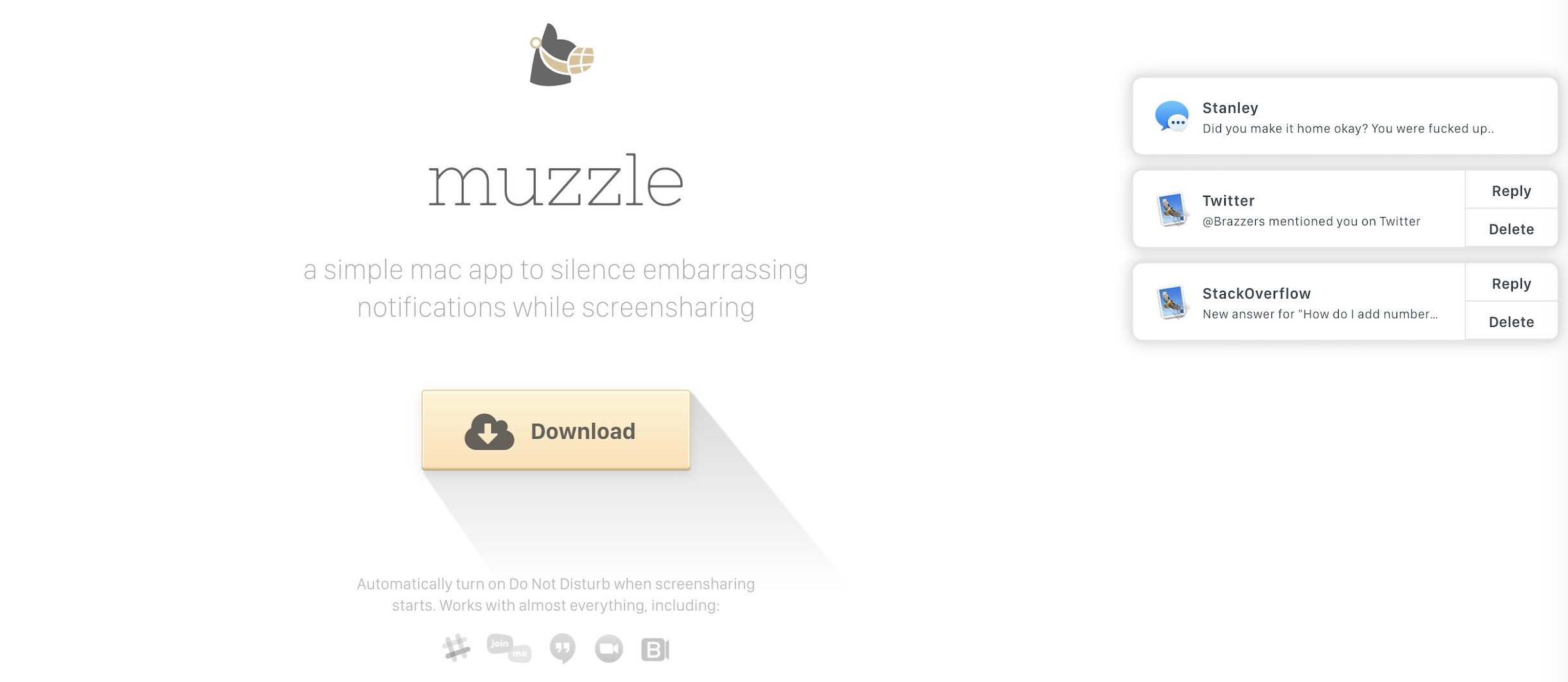
Muzzle is a desktop app that mutes on-screen push notifications when screen sharing is especially useful for business. This high-converting mobile app stops embarrassing or distracting notifications from popping up during online conferences or meetings.
Why it works:
- Minimalist design: The page occupies only the first screen, with no need to scroll down. It communicates the app’s value proposition in a remarkably simple and concise way.
- Powerful visual examples: The right-hand section of the page contains funny examples of shameful notifications, which clearly illustrate the issue that Muzzle addresses.
- Unconventional humor: The funny and easily recognizable notification examples make the user pay attention to the page and make them want to stay.
You may need: Top 8 Drag and Drop Mobile App Builder Reviews
4. Cameo
What it is:
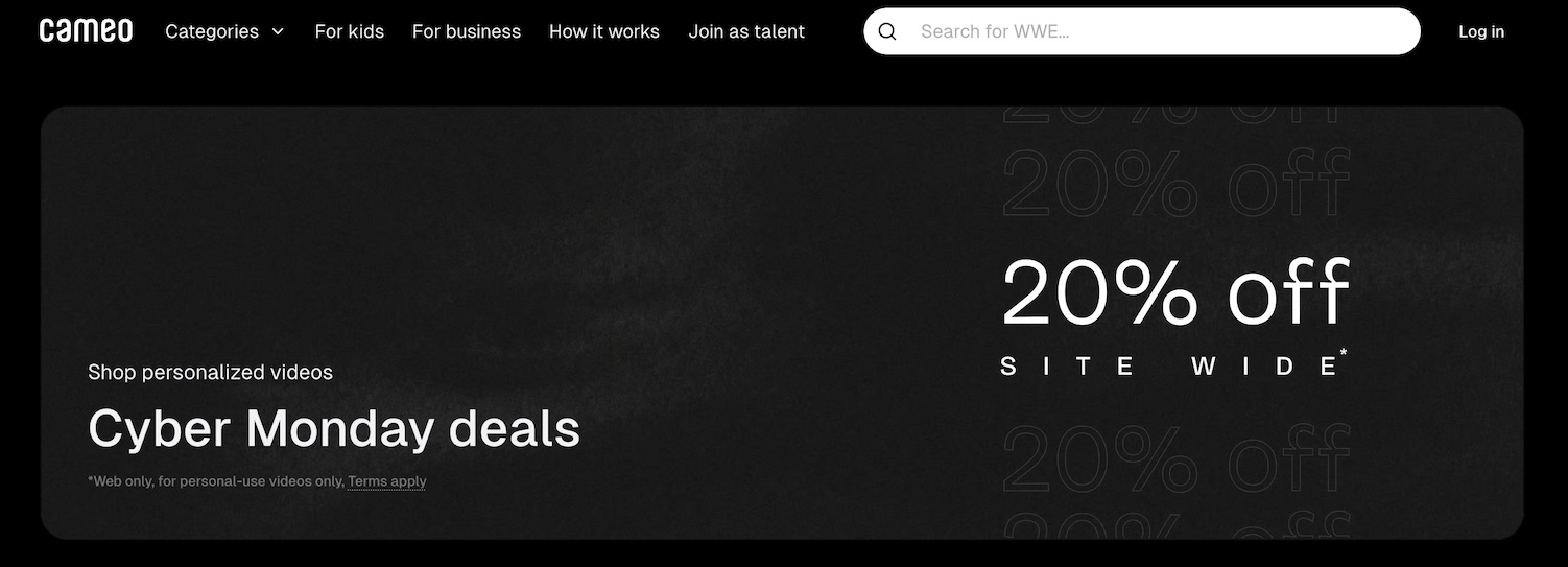
Next is a special service app – Cameo. Cameo lets customers purchase personalized video messages from celebrities, athletes and influencers. The charming idea has its heart in this high-converting mobile app, which is simplified for the user to search for talent, book a personalized message and get videos from the talent.
Why it works:
- The Cameo app landing page effectively showcases how the service works through a simple three-step process outlined at the top of the page. This “keep-it-simple” approach reinforces the Cameo app’s ease and simplicity.
- Additionally, the page uses clever use of animation and video to demonstrate the app’s functionality and the excitement it can generate, such as providing a sample video from “Mr. Wonderful” himself, Shark Tank’s Kevin O’Leary, as well as a video of a fan’s reaction to a message from influencer Cody Ko.
- These elements help inspire creativity and fun, answering the question “What’s it good for?” and making the app’s value proposition clear to potential customers.
5. Carly
What it is:
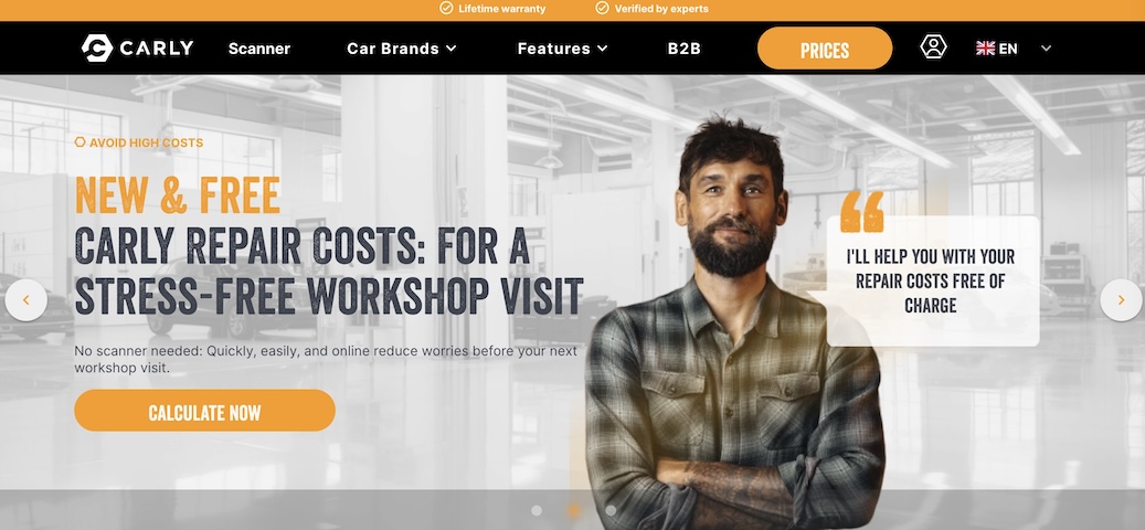
Carly is a “connected car” app that unlocks the secret features and capabilities of users’ vehicles. Unlike other apps that just go and install, Carly’s app needs a little extra setup to fully integrate with a user’s car. To solve this, Carly has created a high-converting mobile app landing page that sends potential customers to the right checkout flow depending on the make and model of their vehicle.
Why it works:
- On the Carly high-converting mobile app landing page, visitors can choose their specific vehicle and get directed to a tailored shop page that fits their needs.
- Unbounce’s usual recommendation is a single call to action, but for Carly, it was a good idea to have multiple options when the challenge is to reach prospects based on their car.
- It also keeps visitors engaged through an animated arrow, encouraging them to scroll down to a more detailed rundown of the product’s benefits and clear illustrations of its capabilities.
6. Shopify

What it is:
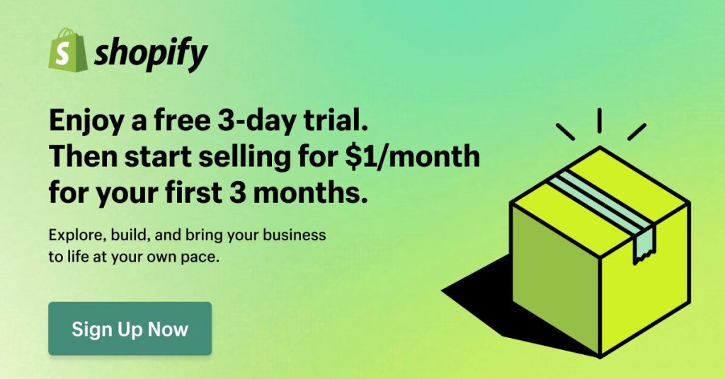
Shopify is an e-commerce platform that powers over 1 million businesses in over 175 countries. It is a complete package of tools and features that will help entrepreneurs and small business owners to set up, advertise, and run their digital stores. It takes care of the technical side of the website build and hosting so you can focus on selling your products and services.
Why it works:
- High-converting mobile app landing page for Shopify is created for maximum conversion of mobile visitors. The page is clean with minimal design, lots of white space, large fonts, and short copy so that you can quickly understand what the platform is about.
- Screenshots of the Shopify platform in action, along with a sticky navigation bar and strategically placed call-to-action buttons, help the user along the conversion funnel.
Shopify also uses social proof by showing who is using their platform, and this instills confidence in potential customers.
7. Slack
What it is:
Communication and collaboration tool Slack is used mostly in business and organizational settings. Slack simplifies workflow and communication by offering a single place for teams to chat, share files, and integrate with other business applications.
Why it works:
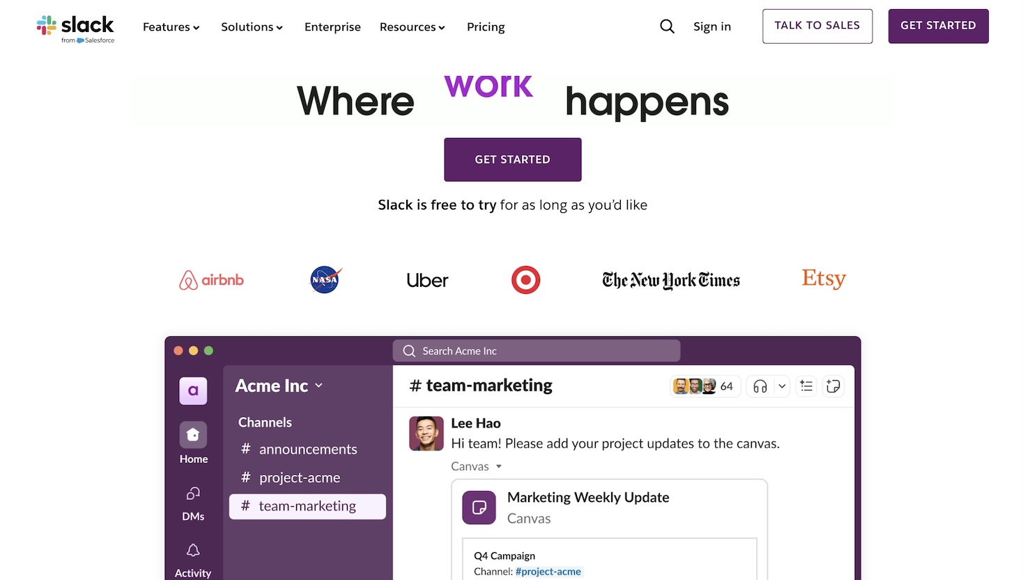
- Slack’s mobile landing page does a great job of highlighting the app’s most important features and benefits. The page is a minimalist design with lots of white space, large fonts and short copy to clearly communicate the app’s value proposition.
- Slack makes it easy for mobile visitors to understand the core functionality of the app by focusing on just 3 main points, accompanied by screenshots of the app in action. It also includes a list of prominent companies that use Slack as social proof and a way to build trust in potential users.
- The “Get Started” call to action button sits at the top and bottom of the page, making it easy for mobile users to take the desired action.
8. Hearth
What it is:
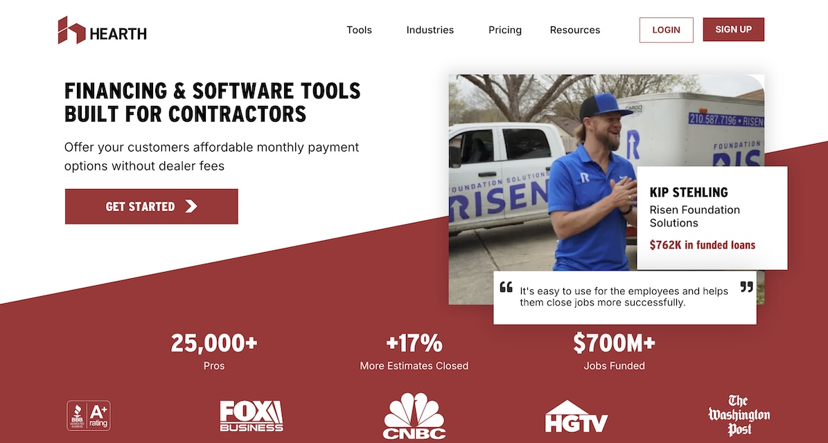
Hearth provides quick, cheap financing for home renovations. They also work with contractors to help connect potential customers to lenders and close more sales. People can pre-qualify for a renovation loan through their high-converting mobile app at any time or during an on site visit.
Why it works:
- Keeping it simple to keep visitors focused: The one clear purpose of the Hearth landing page is to get existing subscribers to download the app. It does it cleanly and directly, without clutter, without distractions, with minimal content.
- Buttons above the fold: Hearth cleverly places the download buttons right at the top of the page, and they’re easy to find. Also, they make the buttons large and spaced far apart to deal with the ‘big hands, small device’ problem that can be a pain on mobile.
9. Canva
What it is:
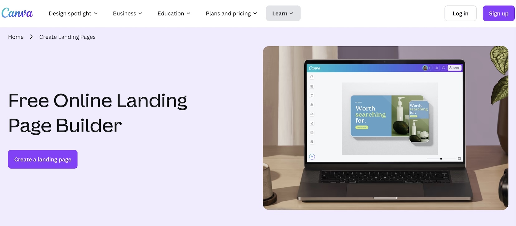
Canva is a user-friendly design application for non-designers that allows easy editing of design, photo and video. This app lets users make professional-looking graphics, presentations, etc and doesn’t even need advanced design skills.
Why it works:
- It’s a distraction free zone, with less navigation to the header, social media links, and footer.
- There are only two additional links for logging in, starting a free trial, and downloading the mobile app.
- A higher conversion rate is contributed to this approach because it keeps users laser focused on the primary action of downloading the app.
10. Tinder
What it is:
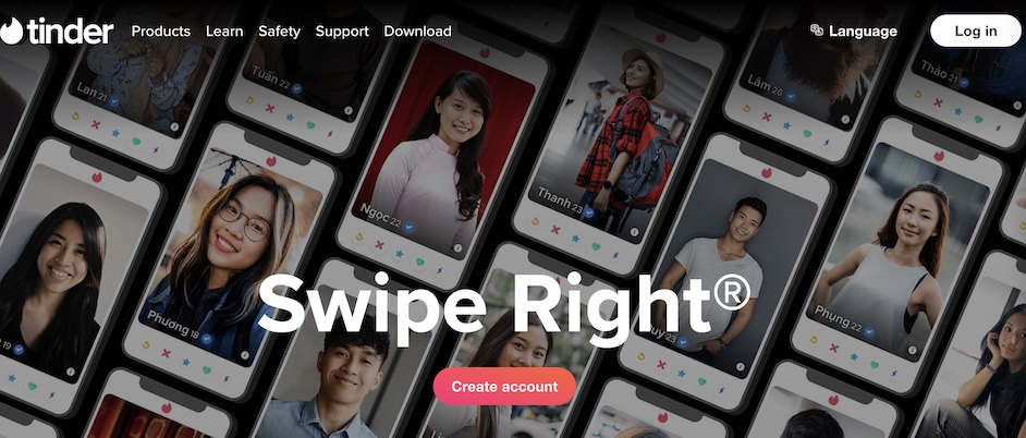
Tinder is one of the most used mobile dating applications which altered the concept of dating, and finding a partner. At the heart of the app’s core functionality is a simple ‘swipe’ mechanic: users view an array of potential matches, and are able to swipe right to like them, or swipe left to dislike. Creating this high-converting mobile app made it possible for Tinder to reach a broad audience.
Why it works:
It is a simple app and the swiping process reduces all the barriers and resistance to get engaged with it. There are no special options that can confuse the users; they are able to find and navigate through the profiles easily.
Tinder exploits our current society’s desire for instant satisfaction. Real-time matches are thrilling and provide that fast, building up pace that users always look forward to.
Features like mutual Facebook friends and shared interests on Tinder work to build trust and comfort between potential matches by utilizing social proof.
11. Calm
What it is:
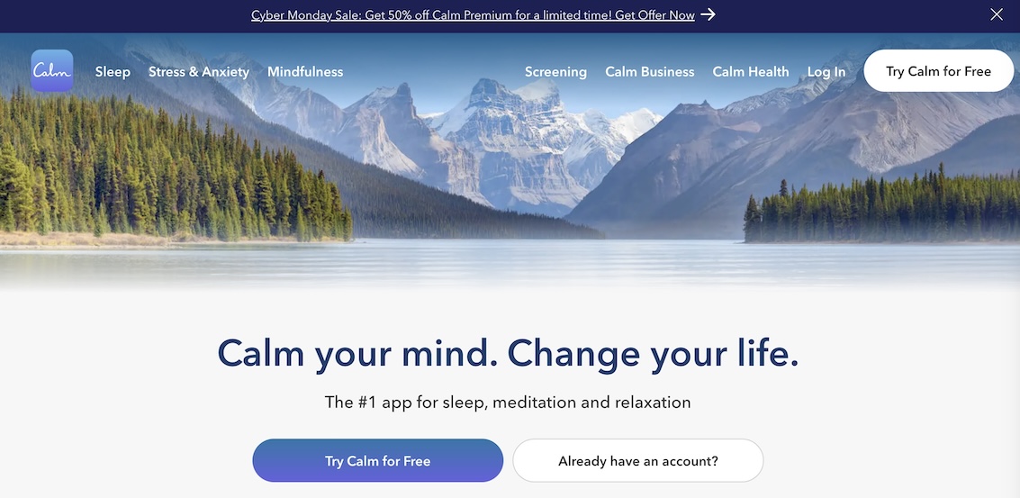
Calm is a meditation and mental health application that enables its users to reduce stress, improve sleep and be well in general. The guided meditations, sleep stories, and other mindfulness activities available cover many types and themes of music intended to help you calm down and stay emotionally stable.
Why it works:
- The simplicity of the design and the initial level of the content makes Calm equally suitable for both a novice meditator and an experienced one.
- The fact that the app can tailor the recommendations and build a unique experience for every user.
- Calm’s visually appealing and calming branding expresses the brand’s core values and creates a calm and consistent experience for users.
- To meet the needs of all its audiences, Calm provides meditation sleep stories and other materials to help people relax and stay mindful.
12. Keeply
What it is:
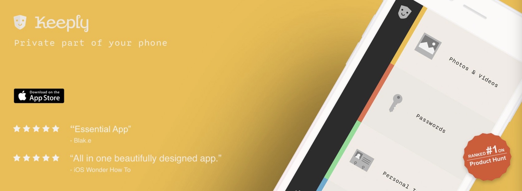
Keeply is a high-converting mobile app designed to provide users with a secure and private digital storage solution. Keeply allows users to store their sensitive files, personal data and other important information, waiting safely with the digital assets of the user from unauthorized access or breach of data.
Why it works:
- The landing page is clear which helps to quickly convey the app’s value to customers.
The use of custom fonts and gradual background color changes as the user scrolls through the page create a visually engaging and cohesive experience.
The single-column layout and strategic placement of the call-to-action (CTA) buttons make the landing page easy to navigate and understand, guiding the user towards the desired conversion action.
Key Features of High-Converting Mobile Apps Landing Page
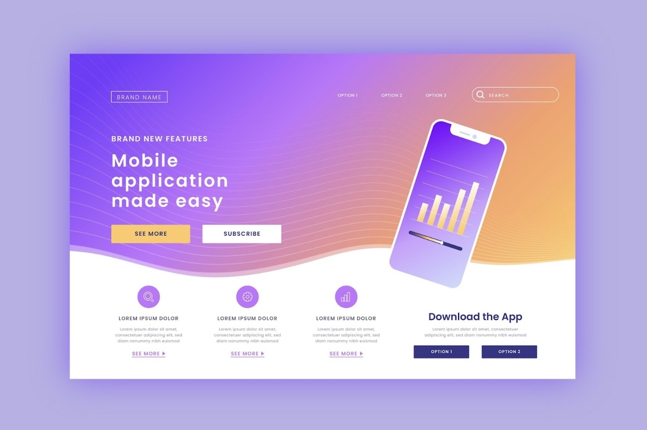
The landing page is your digital storefront to drive downloads and engagement for your mobile app. It’s the first thing potential users see, and it has to make a lasting impression. App landing pages that are successful don’t just look pretty, they’re conversion powerhouses that are carefully crafted to convert casual visitors into loyal users.
So, what are the secret ingredients that make these landing pages so effective and powerful? Let’s dive in and explore the key features that set high-converting app mobile app landing pages below:
- Captivating Hero Section: Your landing page’s hero section is the prime real estate, so make it matter. A great headline, a clear value proposition and an obvious call to action button that will prompt users to download your app will grab attention.
- Streamlined Navigation: Your landing page should be as smooth as silk to navigate. Create a clean, easy to use and intuitive structure, that lets users quickly find what they are looking for be it with a sticky header, seamless Scrolling or visual cues for the user journey.
- Benefit-Driven Content: The content of your landing page should be laser focused on the main benefits of your app and how it solves user problems. Make it presentable by doing this with concise bullet points, feature explanations and testimonials that speak directly to your audience’s needs.
- Visually Engaging Design: Your landing page can be all about the visual elements. Use eye-catching imagery, videos or illustrations to bring your app to life and create an immersive, brand-aligned experience.
- Optimized Calls-to-Action: The prominent, visually distinct call-to-action buttons on your landing page should be clear about what you want the users to do: download the app or sign up for a trial, for example.
- Responsive Layout: As mobile first is the name of the game, your landing page needs to be fully responsive and optimized for different screen sizes and devices. It guarantees our users have a consistent experience on the go.
Sum Up
As you can see, a high-converting mobile app landing page isn’t just about a quick call to action but it also provides a tailored experience. However, creating one is not something you have to do on your own.
That’s where SimiCart comes in. SimiCart team has over 10 years of experience in the mobile app development space, and we know what it takes to make landing pages that truly stand out.
So, let’s build a powerful one and captivate your audience like never before!
